
Navigate your way
by Your rules
OVEVIEW
User will also have the ability to choose his preference filters which will make his journey more personalised and apt to him.
Based on the inputs from the user, AI will analyse all the factors and generate a best suitable route for him; utilising all the modes of travel available at that place for the best results.
Youtube video of full app walkthrough
COMING SOON
Click here to experience NaviQ
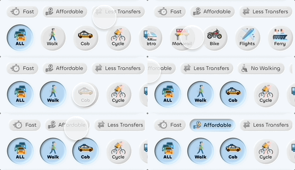
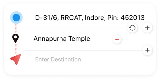
Selecting Preferences
Selecting prefered Modes of Travel
Adding intermediate stop points
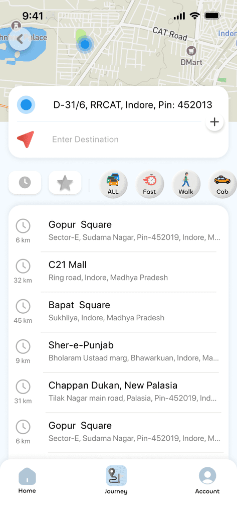
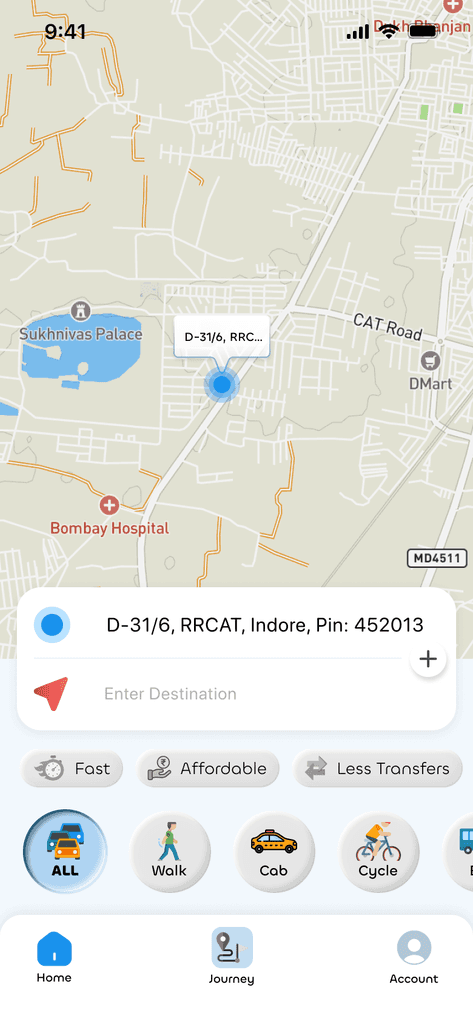
Entering Destination
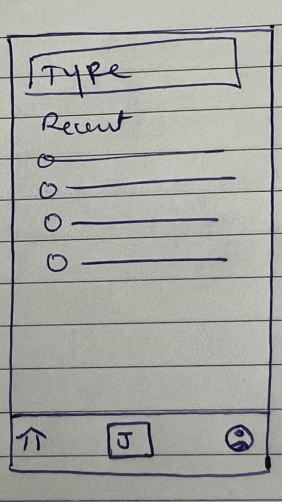
User can select from his Starred locations and he still has the option to review his preferred modes of transport from the top bar.


Decreases Cognitive load

Reduces Decision time
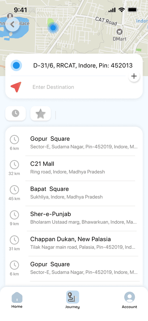

Personalised routes recommendation
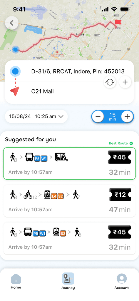
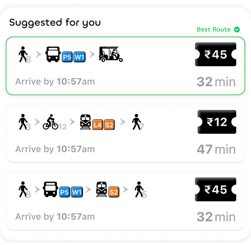
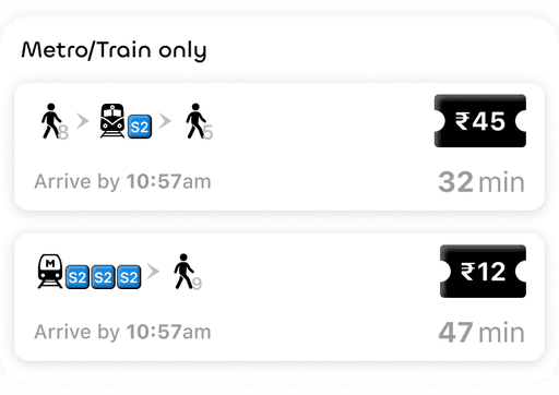
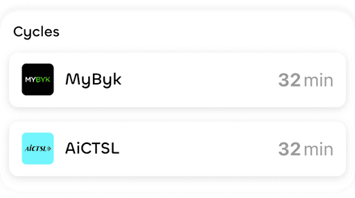
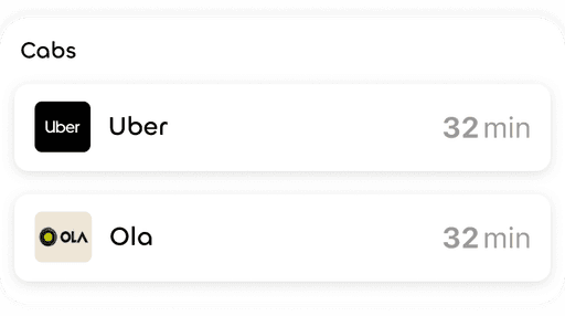
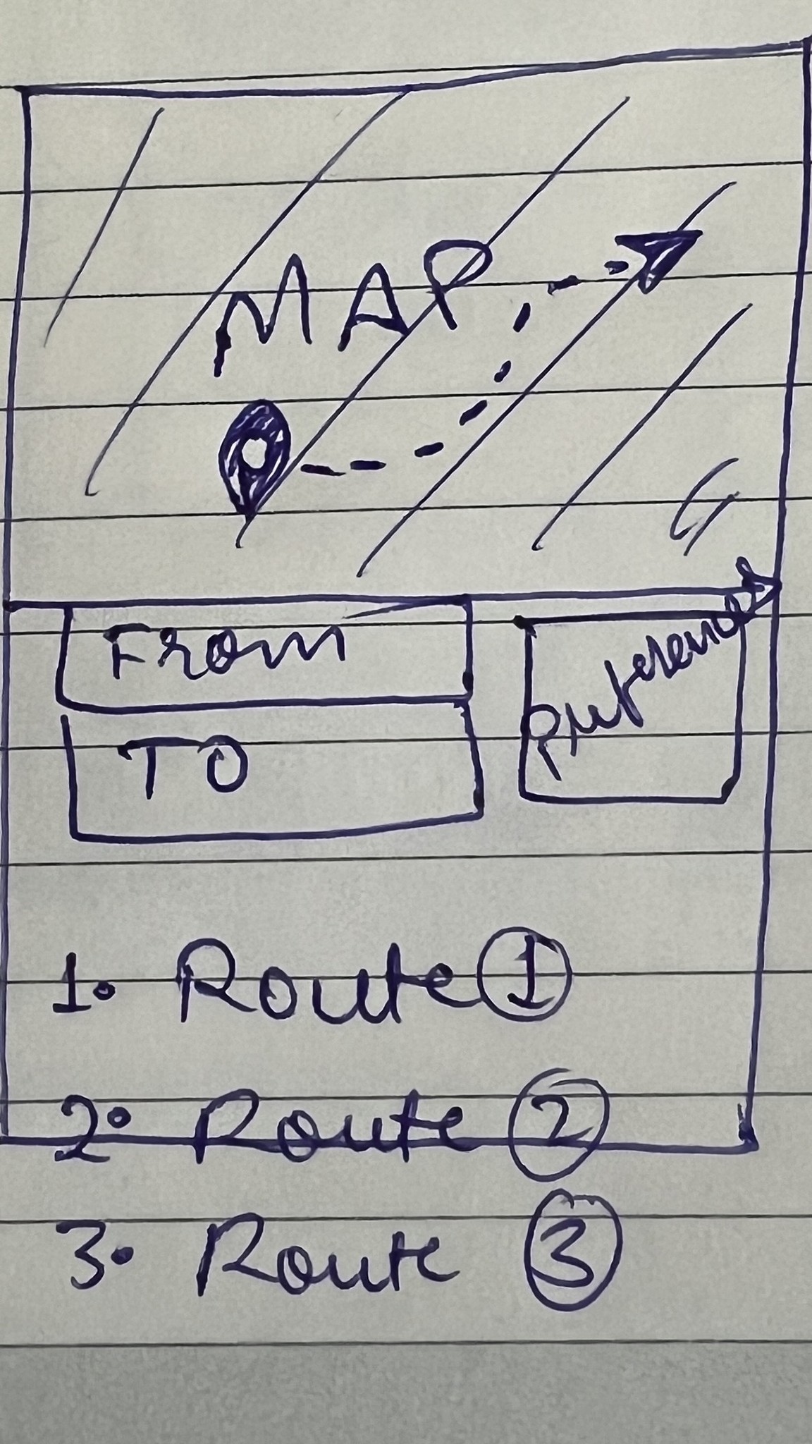
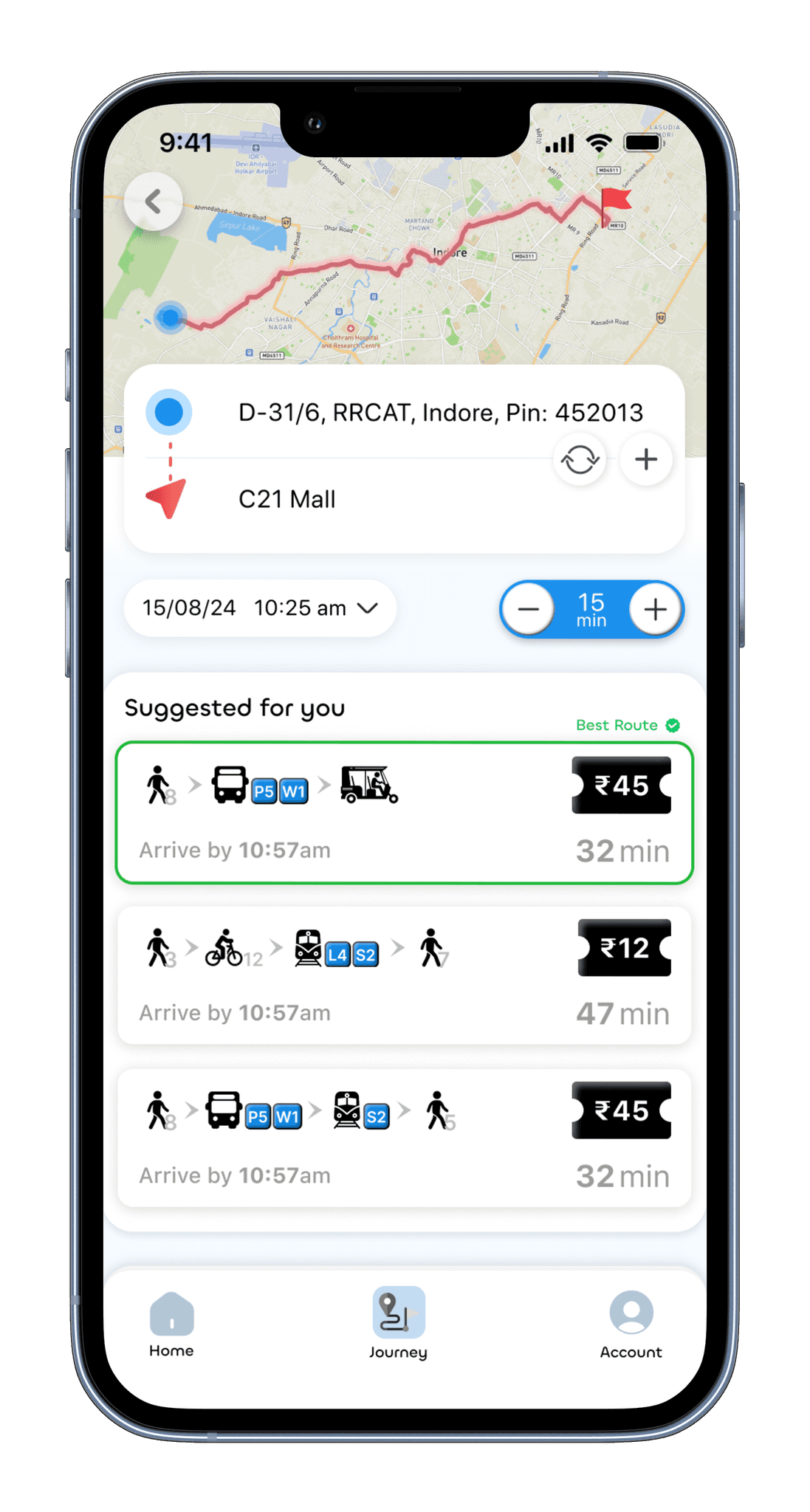
AI generated best possible route wrt user's preferences. Other popular options like cabs, etc. will also be visible down the scroll.
(Scroll it)
Best Route


Recommended route stays at top for quick decision time
Colour coded Bus numbers
Walking time indicated

This feature decreases the decision-making time, helping to boost conversion rates
Next departures
+
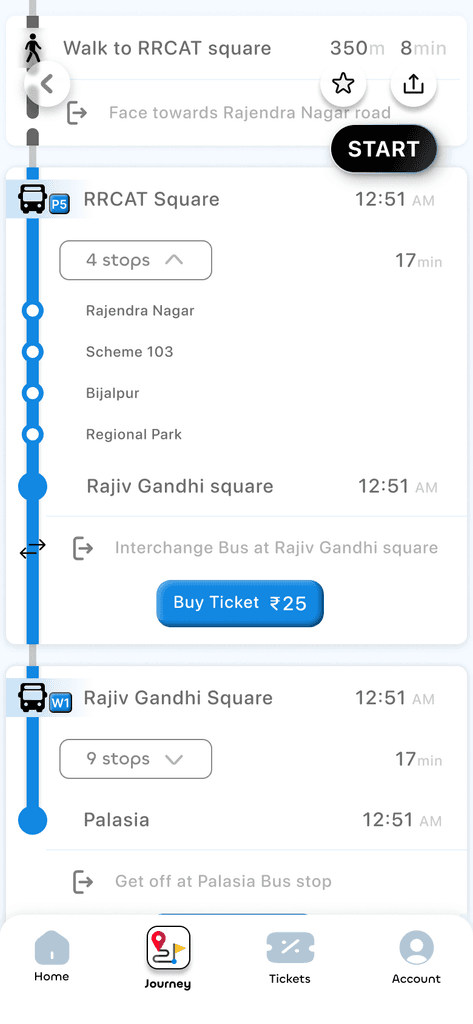
Intermediate stops
Next bus departures schedule is accessible. User can view the intermediate stops for better understanding of the route
4 Stops


Alert notification
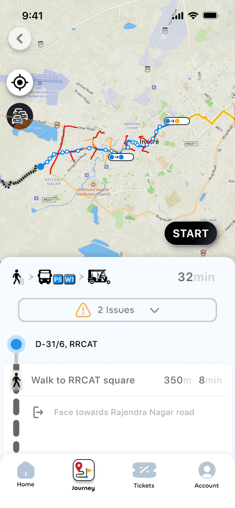
User will be able to see the issues/alerts on his journey path, so as to make better decisions while selecting routes

2 Issues

Ticket booking
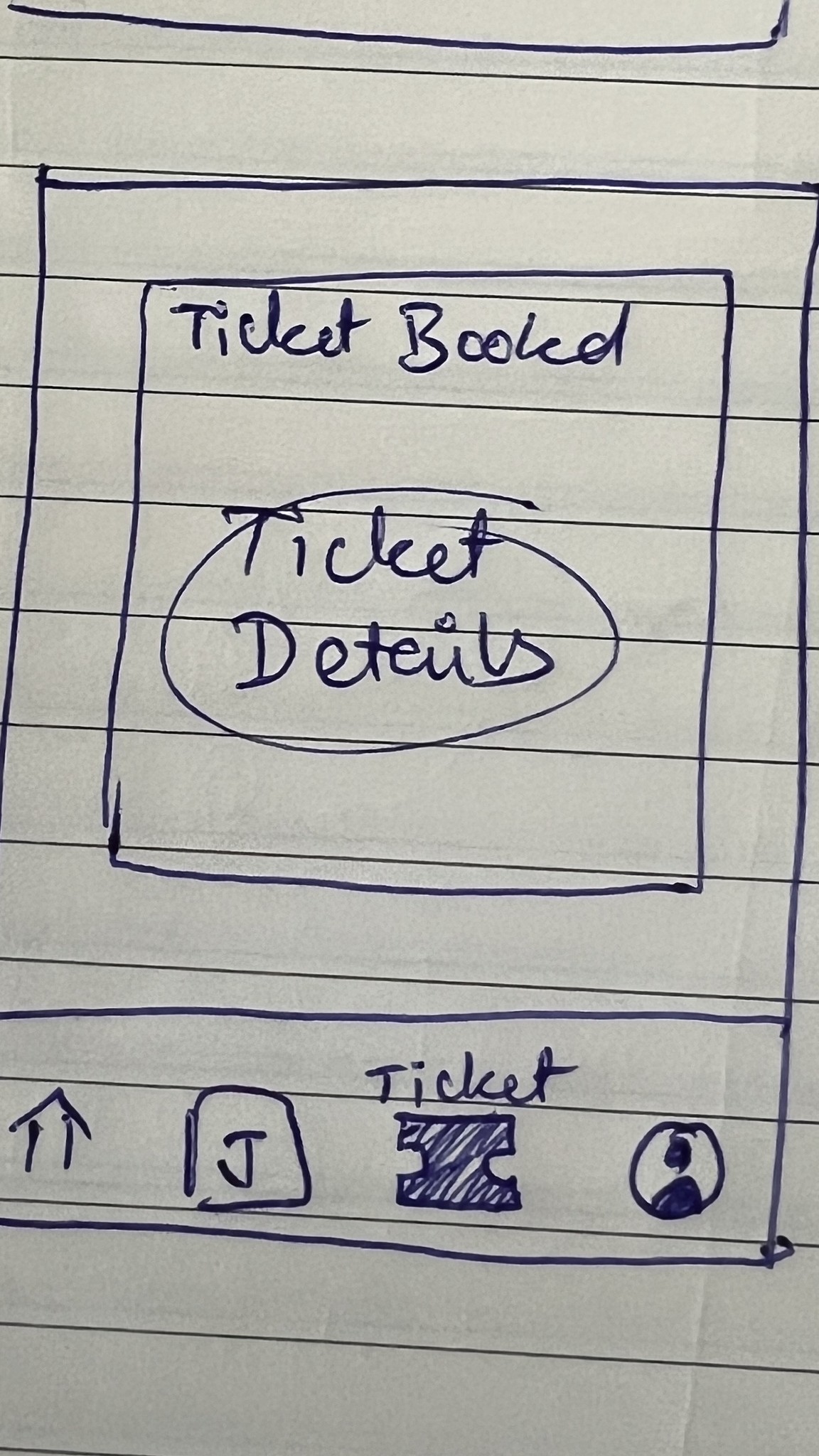
Tickets can be purchased online and can be downloaded within the app itself for easy accessibility. A dedicated tickets section appears in the bottom navigation bar
Tickets


Detailed Itenary
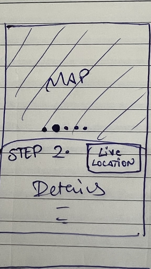
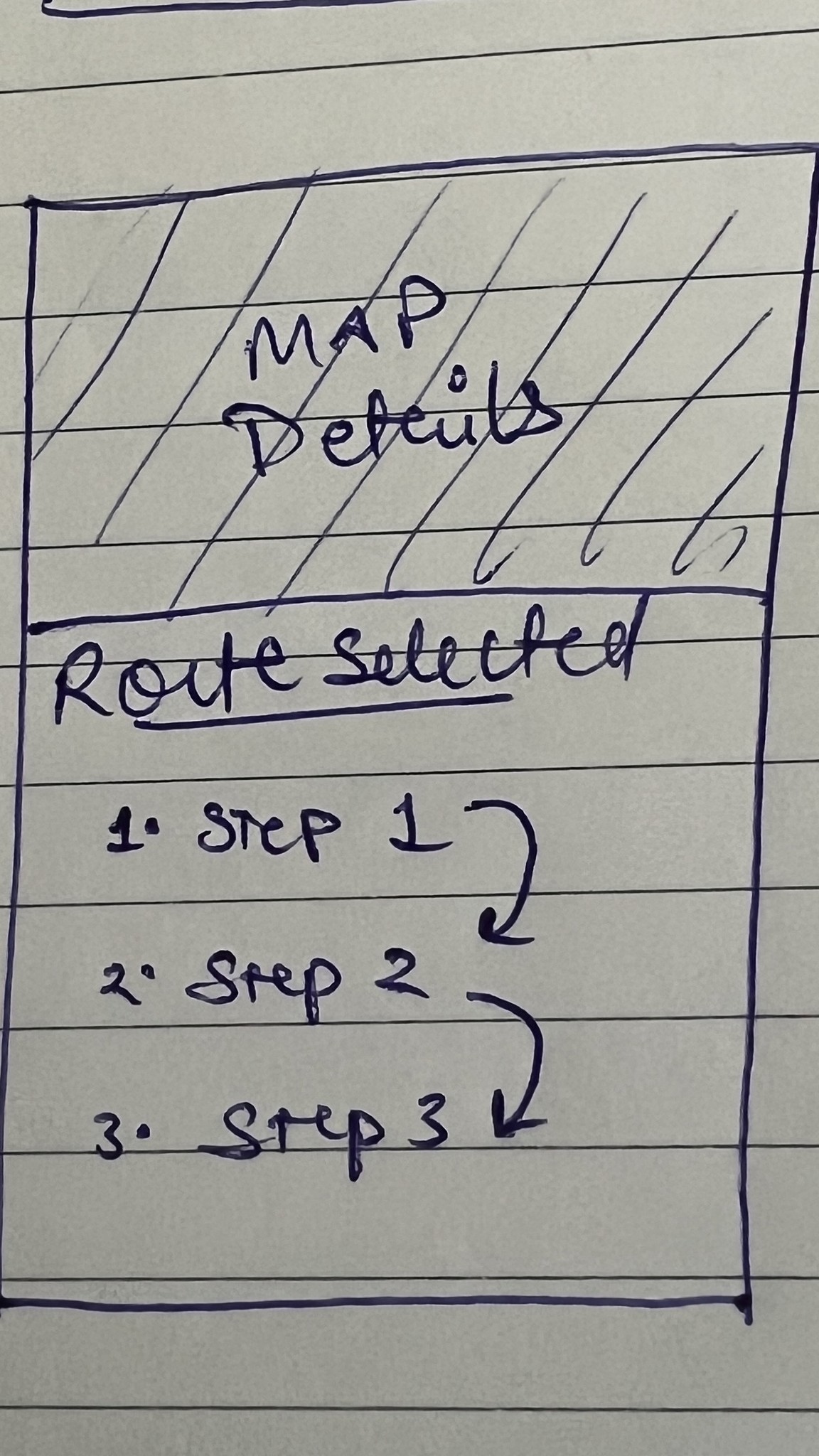
When the user selects to the journey, a fragmented form of his entire route is displayed in the form of slidable pages. User can have a detailed information regarding the itinerary. Live notifications of the transit and traffic information can also be viewed in this section.
START

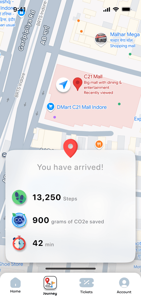
End of Journey
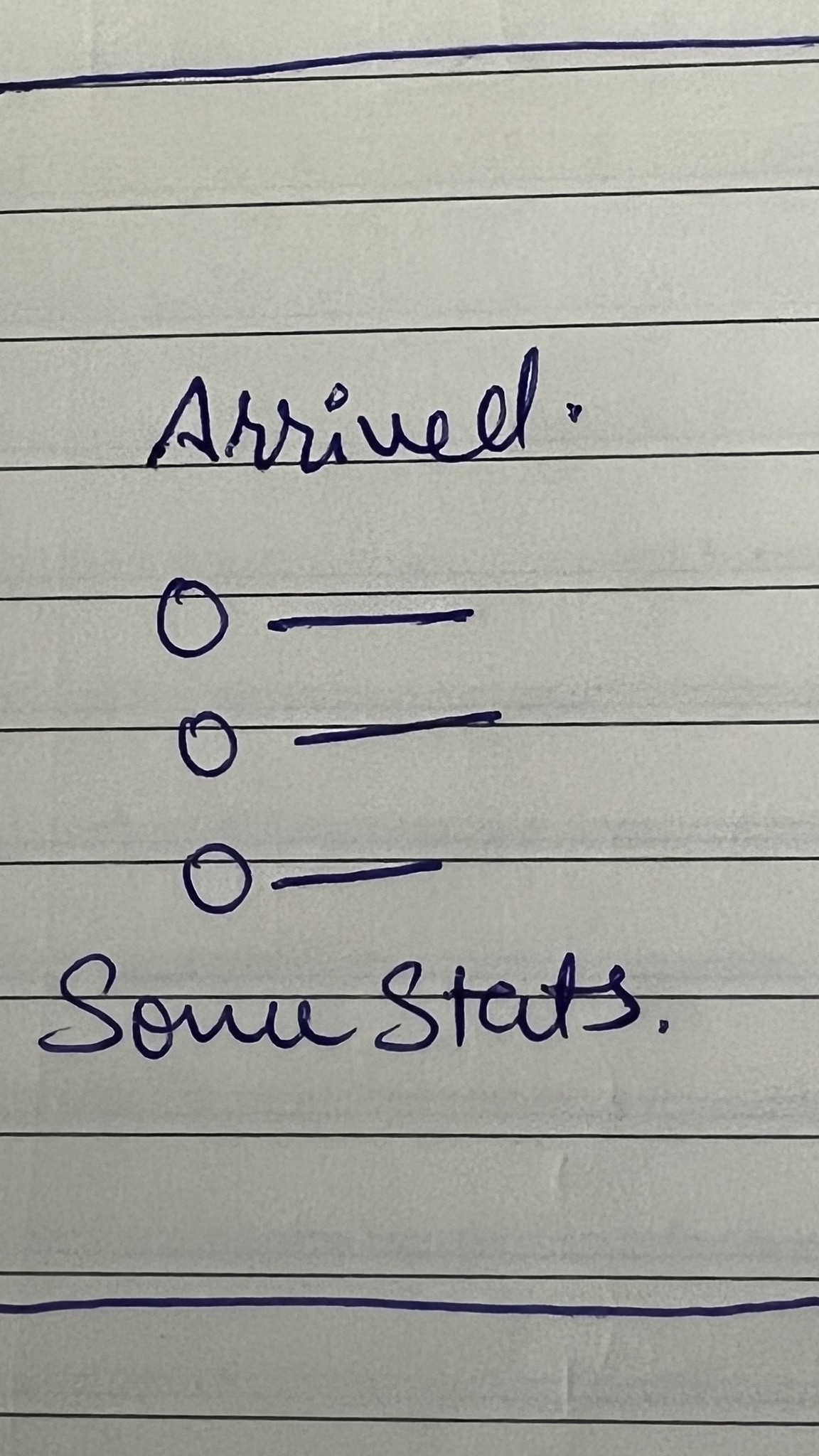
Stats of the trip are displayed at the end of the trip, viz. total steps, CO2e saved and the time taken to complete the journey.


A lot of design thinking and creative analysis has been done to incorporate the features which help the user of NaviQ to make his journey seamless and easy.
Several critical decisions were made to forge the app that gives it the interface which goes hand-in-hand with the functionality. Let me share some of the critical decisions I made during my design process
How I adapted a real-world feature and made it fit seamlessly into mobile screens
When I was building my initial hypothesis for the problem, I needed validation from real users about their journey while travelling from public transport. After talking them, I learned:
Users seek comfort while travelling via public transport
Most local/metro coaches are overcrowded-> lack of seats
I wanted to understand the root cause of this, so I decided to dive deeper into the issue. I also travelled in local trains for observation. Few things that I observed:
how people find the desired platform.
what mode they take to reach the platform (stairs, escalators, elevators).
why crowding happens (besides population increase).
how the crowd gets distributed among the coaches.
After gathering insights from my observations and conversations with people, I boiled it down to two major points:
Passengers usually consolidate around the coaches near to the stairs
Coaches near the stairs gets covercrowded; and those at the ends stay relatively vacant
Look how Delhi metro is solving this issue at some stations
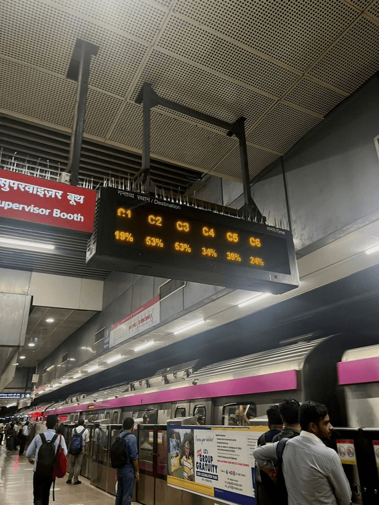
The boards show how full each coach is, helping users board the less occupied ones and possibly find a seat. Although the crowd size wasn’t reduced, but the distribution was much more balanced.
I thought this feature would be useful for improving user comfort in metros and should be available for all metro lines and local trains.
I decided to incorporate it into the app.

In user testing, they struggled to understand the coach occupancy percentages and coach labels on the mobile screen.
I also identified scalability issues; the current table format may not handle additional coaches effectively.
But this approach didnt work in user testing ❌👎🏻
I realized that mobile interfaces have far more constraints than large screens.
Designs must be tailored to the specific interface users are on to ensure usability.
The challenge was to make coach occupancy data both easily understandable and scalable.
Recognizing that visuals often communicate more effectively than text, I decided to present the data visually.
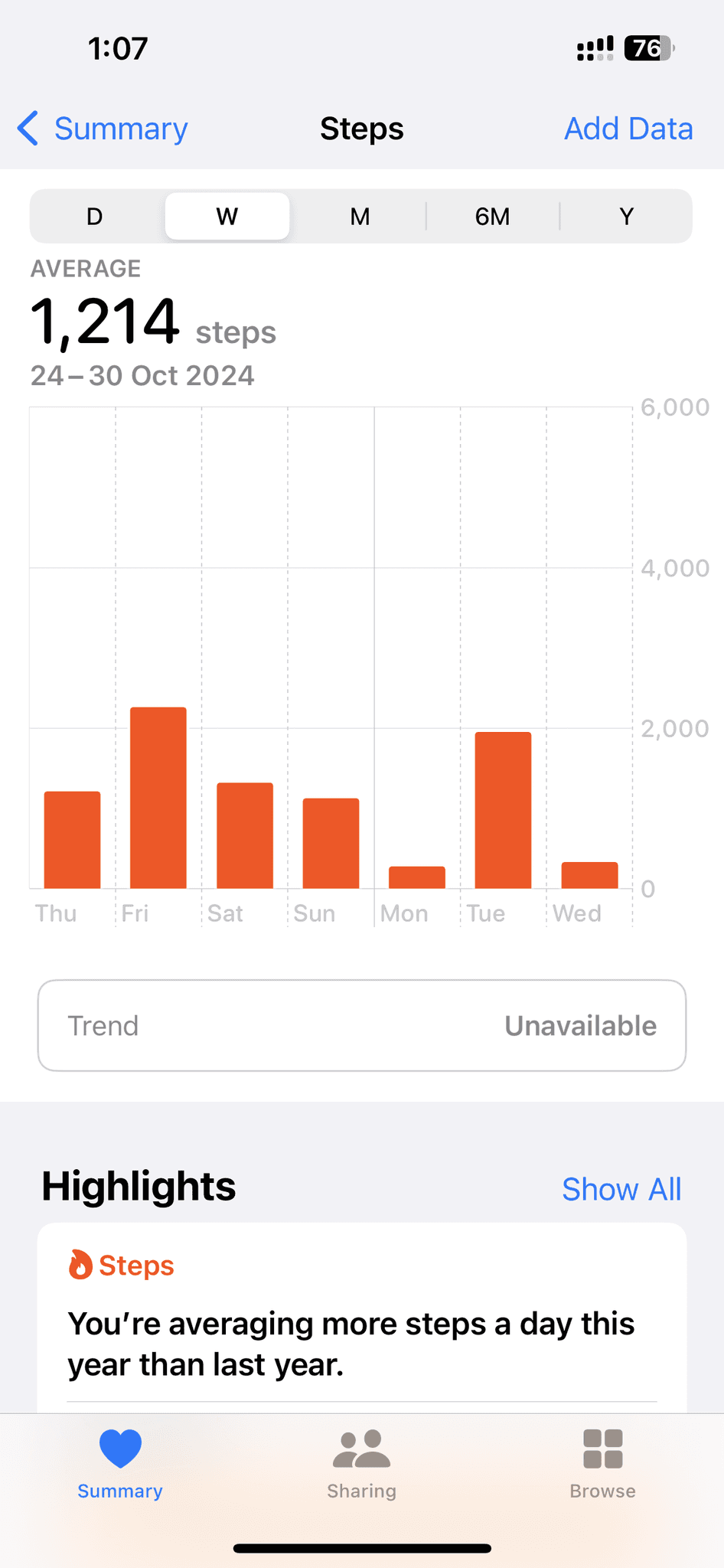
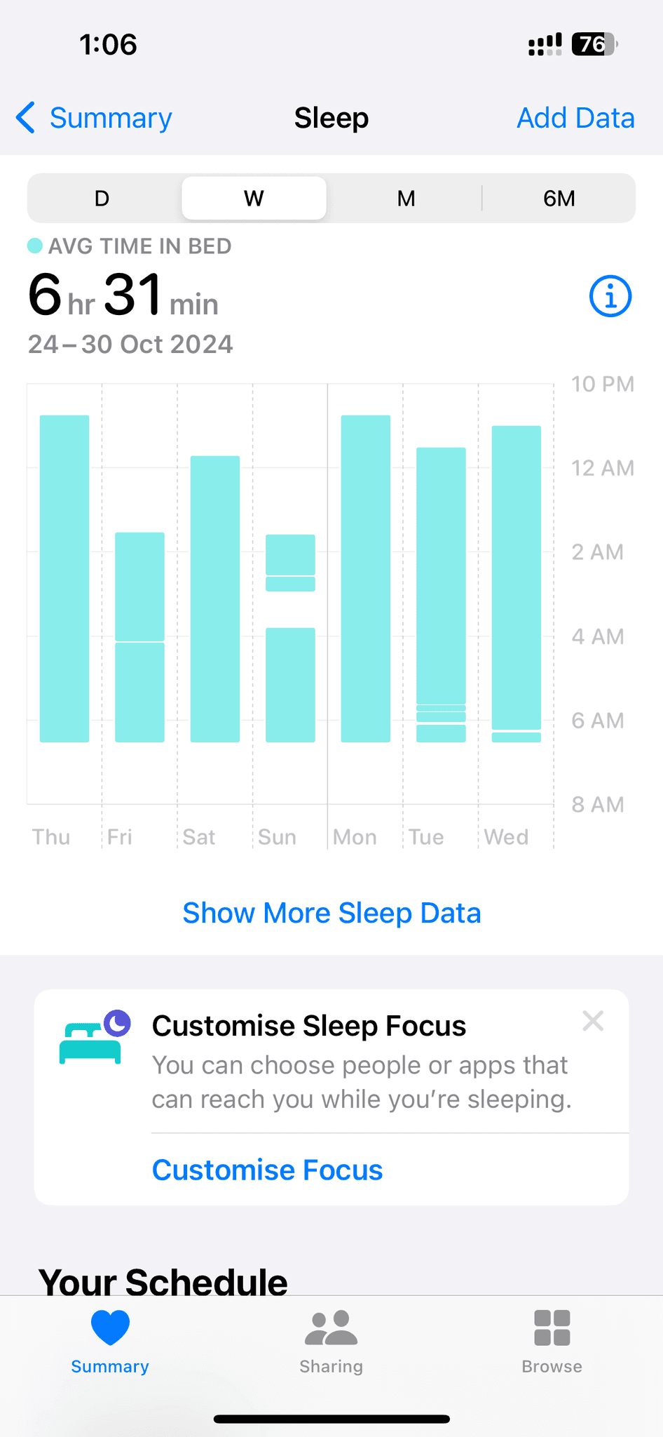
Inspired by how health apps like apple health display step progress, which clearly conveys a lot of information, I applied a similar approach to the coach occupancy data.

I had limited time for iterations.
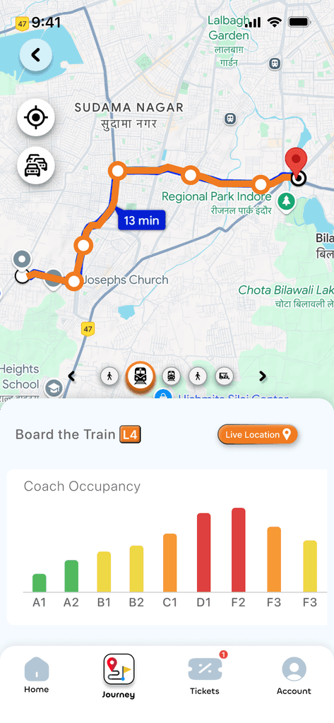
I quickly developed a visual representation of the data, leading to the following design:

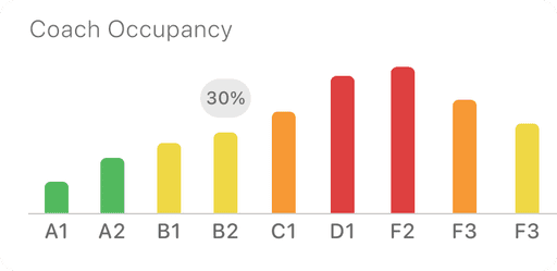
Color coded visual representation (depending on the crowd) made it easier for the user to understand at just a glance
Pressing any bar will display the actual percentage in digits for expanded information
Scalable -many coaches can be added without cluttering the UI of the app. This section is horizontally scrollable.
The design proved successful in peer testing! 🤩 ✅
Users easily understood that the graph displays coach occupancy, with the least occupied coach clearly visible through green colour and bar height.
Some changes in data visualization made the design more efficient and scalable.
How I made on-foot navigation during the journey easier and accessible
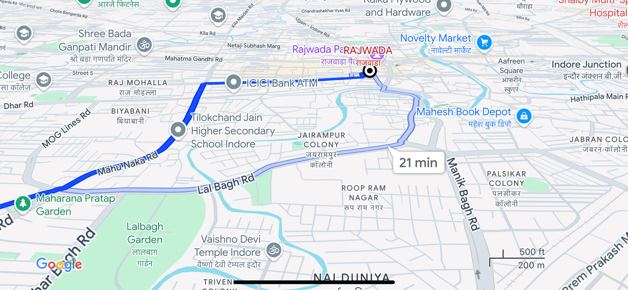
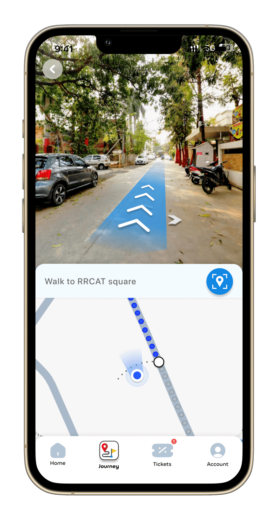
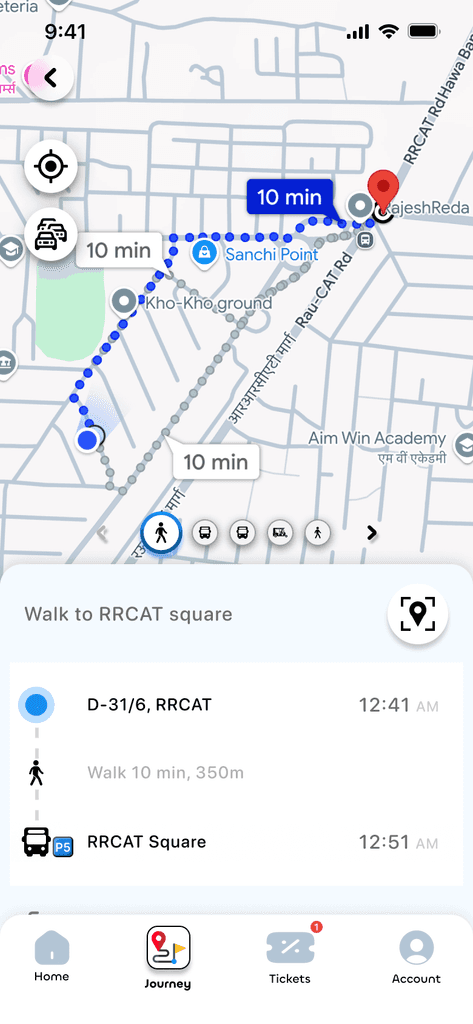
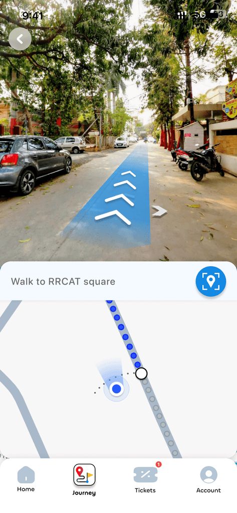
For a person new to the city or unfamiliar to the routes, locating landmarks might get difficult. Although the navigation of map tells the real time location, it can be designed in a better way to be more intuitive and display the path in the AR space.
Inspiration
NFS(the car racing game) has these direction arrows which guide the player through the route leading to the finish line. It reduces the reliability on the map and hence increases focus on the race.
Many AR apps are imposing 3D objects into real time camera movements, which can also be implemented in this app for better foot navigation.
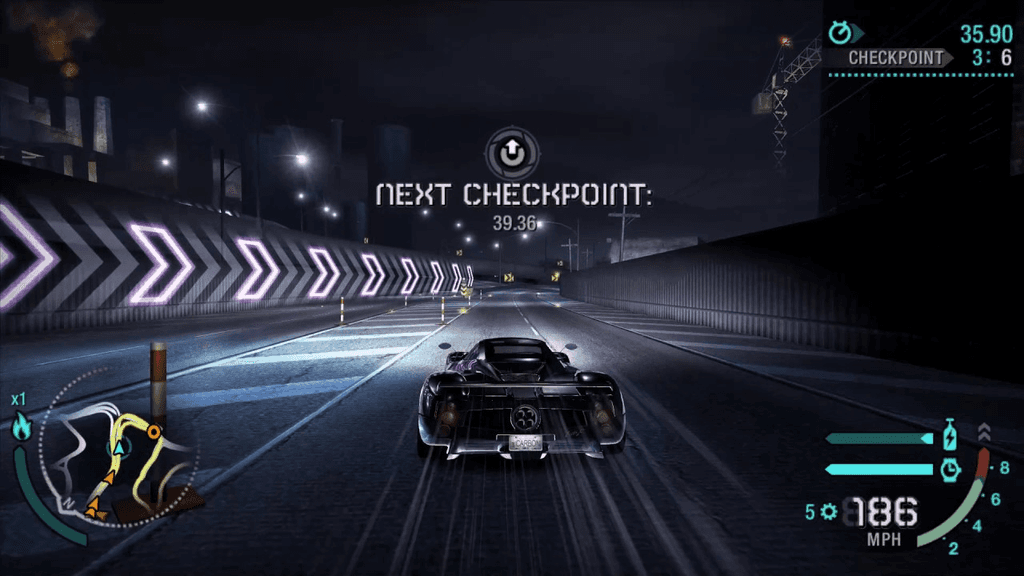
For people who find it difficult to understand and comprehend the complex routes on the map, this feature will make the task a lot more easier.

Enhances accesibility and inclusivity

Establishes trust on the app
A glimpse into 'Behind the Scenes' of this app's architecture
To get started, i imagined a user named Billu and his journey based on some basic assumptions
Assumption Journey 1 :
Small town resident Billu shifts to Indore for work

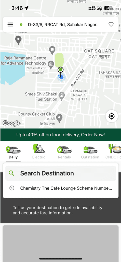
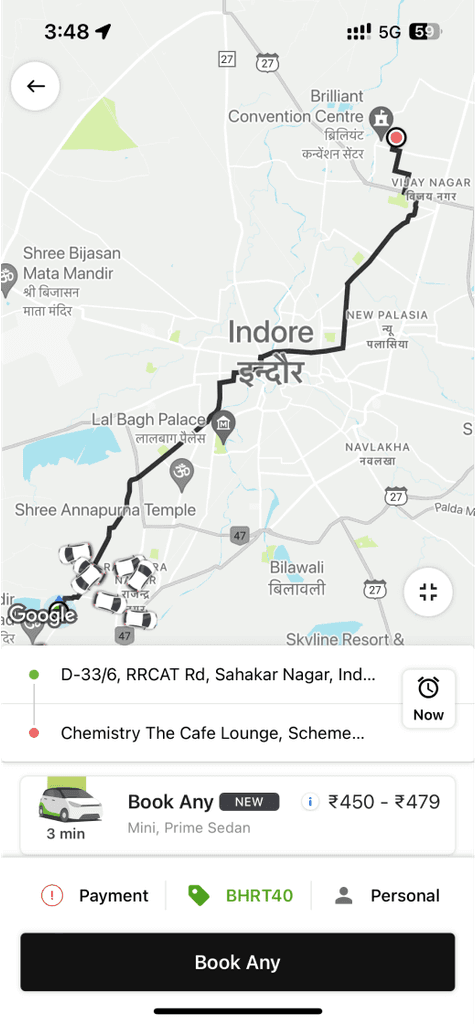
Checks taxi fare from the bus stop to his location. Its very expensive and Billu cant afford it
Billu is an introvert and feels shy to ask for better options from strangers
This city is new to him.
Unfamiliar routes
Opens NaviQ and sets his preference to affordable options for his destination
Even when unable to figure out the landmarks on the map, he's able to understand the route via path finder feature of NaviQ
Billu realises he gets feedback of the rides on his app itself. He gets the tickets online, live location, etc
He's offered a route which includes cab, a bus ride and a few steps of walking
NaviQ suggests him a personalised route as per his preferences set in the app
He realises he saved quite an amount by using NaviQ. It became a handy tool for him in this new city for future travels too


Assumption Journey 2 :
It is monday morning and Billu is getting hit with the blues
He heads towards the metro station and realised he might not be able to board the 8.00am metro and will surely get late.
To reach the station he is confused to decide which of the fastest transport to choose from.
Tensed, he opens the NaviQ app and hurries to find any nearby rides/cabs/rickshaw etc
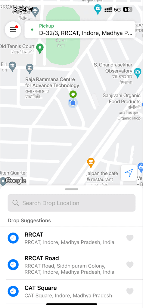
Enters his source and destination and finds all the rides available
He's able to board the 8:00am metro
He sits on the bike and reaches metro station on time.
He makes the payment and the rider arrives.
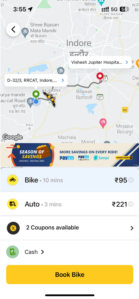
He selects bike ride and the app finds the nearest riders.
The app suggests him to select a bike ride to pass the peak hour traffic faster as compared to cab or auto.
He is able to see the prices, duration and carbon safe vehicles.
This gave me a solid starting point.
I mapped out the user flow to capture the emotions someone might feel when running late for the office; and when someone is not able to afford cabs. With this understanding, I began to identify the user’s potential goals, such as:
Wants to opt the fastest route possible
Need direction assistance to reduce decision making efforts/time
Wants to understand the parameters of each ride in some detail
Curious about Live notification of the routes as well as upcoming rides
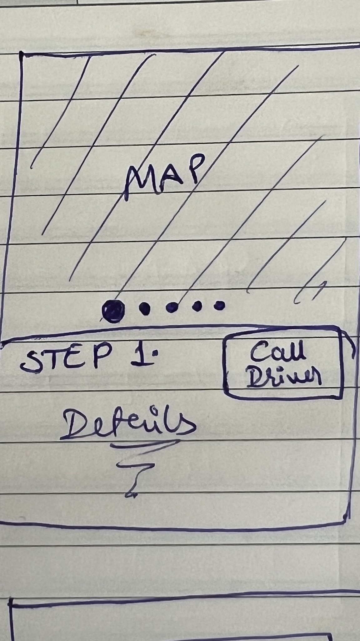
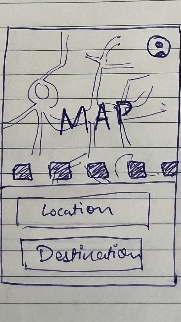
With these goals in mind, I sketched out some ideas and started creating screen designs based on the experience I wanted to provide.
I again went into mapping these sketches to dive more deeper and generate better ideas
The main focus was understanding the user’s thoughts while interacting with these early-designs. This process was very helpful, leading to clearer user goals and some viable solutions.
I organized similar insights together, making it easier to analyze and understand.
Here are a few selected solutions that emerged from brainstorming with my initial ideas
User can have other preferences apart from transport
Real time traffic should be displayed to make user less anxious
Download ticket option in the app data itself
Live location of upcoming transport as well as next departures

I felt stuck at this point, as the ideas were quite surface-level.While validation was needed, the good thing was that I had a solid foundation to research from — my initial hypothesis.
I didn’t want to be biased by my initial hypothesis, I approached research with an open mind, seeking cues to refine my ideas.
Based on my hypothesis, I focused on a user type:
Working professionals in Indore who use various forms of transport for their daily commute.
I decided to have a conversion with such users, to test whether my solutions would work for them.
I asked open-ended questions about their daily commutes and gathered valuable insights


User interviews
GIF
(Soon to be Uploaded)
User interviews
GIF
(Soon to be Uploaded)
User interviews
GIF
User interviews
GIF
Some patterns i observed…


At this point, I had a clear understanding of my goals and the problems I aimed to solve.
With a refined direction, I :
Began exploring how other apps and systems addressed similar issues.
Travelled on the metro (as mentioned before), went to stations of various lines to understand why users were lacking comfort there.
And kept dumping the thoughts and findings on my file, making some notes and comments here and there :
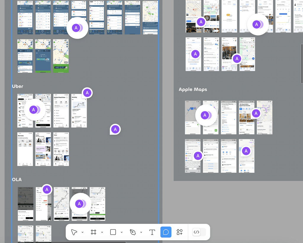
Competitor Analysis
Indirect Competitors
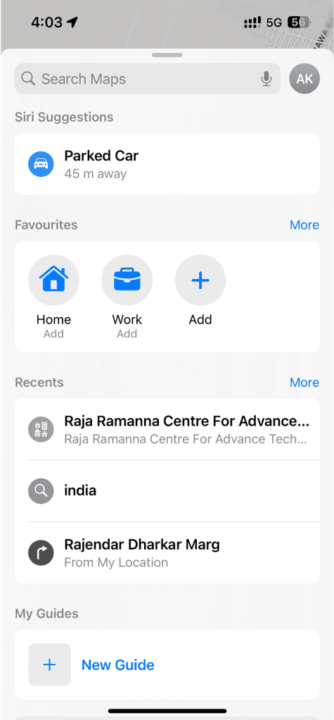
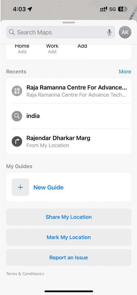
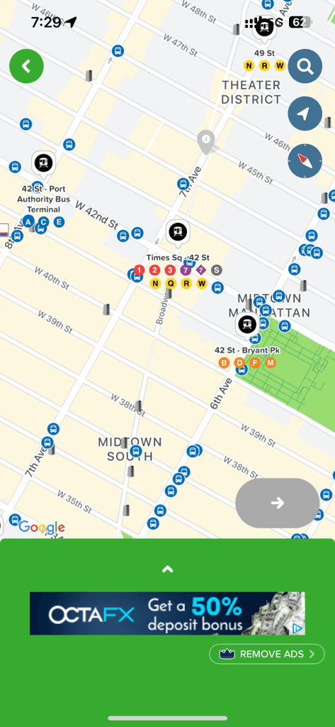
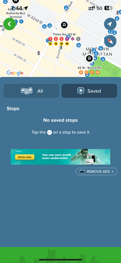
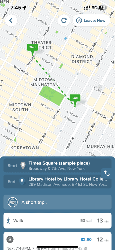
Apple Maps
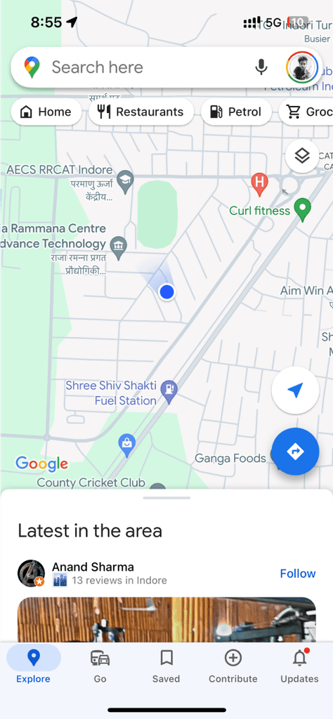
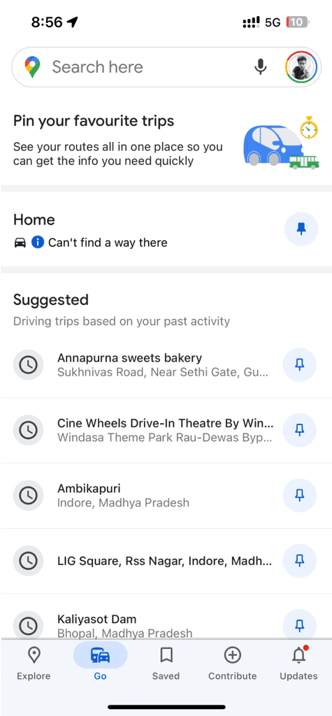
Google Maps
Direct Competitors
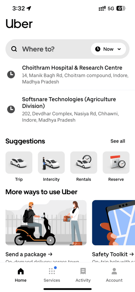
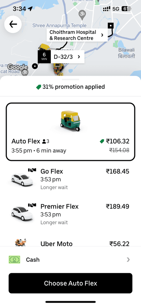
Uber
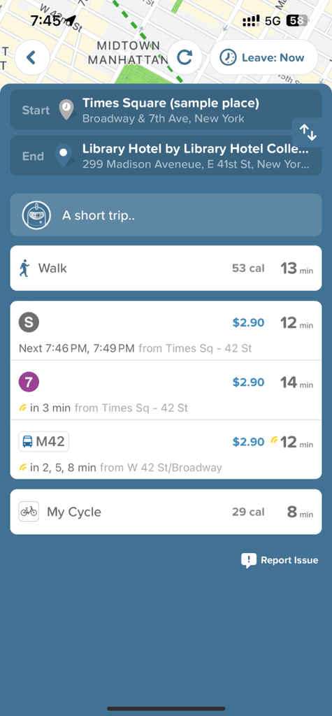
Citymapper
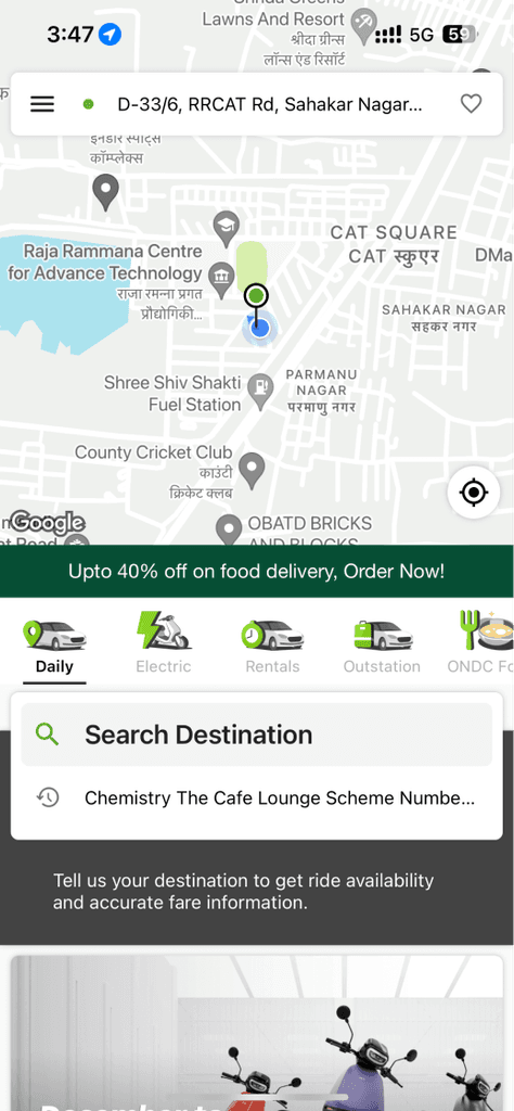
OLA
Rapido
Insights from Competitor Analysis
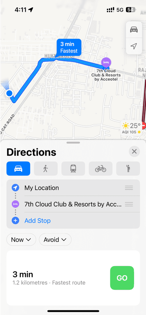
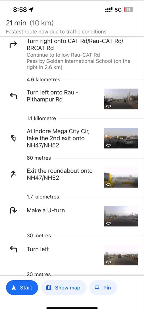
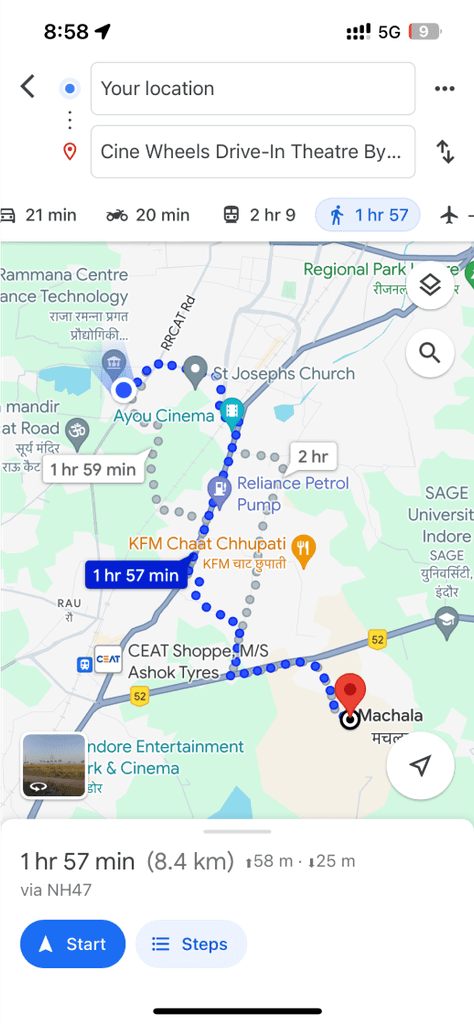
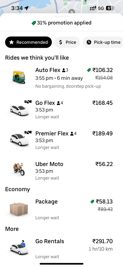
Almost all the apps in the market serve only direct modes of travel(car and bike)
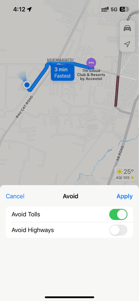
Lack of preferences and filters. Only one type of conventional way of travel is provided
Accessibility issues for people with some kind of impairment
Environmental impact is not being taken care of properly
How my initial hypothesis refined?
Talking to people revealed deeper problems and opportunities beyond just finding the best routes.
I discovered that delays often occurred after boarding transport as well, impacting users’ ability to reach their destinations on time.
For this project, I focused on key issues with potential solutions and refined my initial hypothesis.
Here are the specific problems I decided to address:

At this point, I had a clear understanding of my goals and the problems I aimed to solve.
With a refined direction, I :
Began exploring how other apps and systems addressed similar issues.
Travelled on the metro (as mentioned before), went to stations of various lines to understand why users were lacking comfort there.
And kept dumping the thoughts and findings on my file, making some notes and comments here and there
Designing the Visuals of the app
NaviQ. Navigate Quickly


Location


Navigation


NaviQ

I crafted a logo that subtly reflects NaviQ app's essence, ensuring users intuitively connect with our product.
The logo concept offers a whimsical depiction of graphics related to location and navigation, making a Q(of NaviQ which denotes quick travel as mentioned in the app's tagline). And its then complemented by a clear and easily readable typeface.


App store screenshots for irresistible conversions
I enticed users to download the product with captivating screenshots that highlight its unique selling points and irresistible functionality.
Design atoms that shaped NaviQ
Primary colours

Typography

Typeface

Chillax
Light
Regular
Medium
Semibold
Bold

Fonts
Assets and Components


…and many more in my messy
file
These components are the result of numerous iterations. Every now and then during the project, I consistently asked myself,
“What micro problems can I solve to make users’ lives a bit better?”
This approach led to the design flow.
By empathizing with users — understanding their journey, thoughts, actions, and indecision — I built scalable solutions that enhance their experience.
This focus on user value aims to increase both conversions and loyalty.
A look into the rearview
Working on this project within a limited timeframe was a valuable learning experience, especially designing under time constraints.
Initially, I approached the project with surface-level ideas and added not-so-necessary screens. However, after seeking guidance from my mentor, I learned to focus on micro user actions and prioritize effectively.
This process not only reduced the number of screens but also streamlined the user experience, enabling users to make informed and quicker decisions, ultimately improving the conversions.
One idea I had was to eliminate the hassle of daily route selection and ride booking, but I decided against it as it didn’t align with the business goals. However, this concept holds potential for future iterations with a more informed design approach.
For now, the app only accommodates a “happy flow” for users. Addressing other use cases and currently untapped flows will be an important focus in the next phase of development.
Future scope
If i had time i would have worked upon this edge case:
If bus/train is facing unexpected delays, then the ability to book alternative options. The app should quickly send alert notification and provide an alternative option.
But as this may cause user to drop off, this should be done after proper research.
Scalability of bus/train icons is a potential issue. What if the name of bus/train is too long? If time was not a constraint, I could have designed the buttons and icons keeping this in mind.
Since this app could be used at any time of the day, a dedicated dark mode could be designed to enhance the accessibility of the app during night or in darker environments.
The user should be able to set the dark mode intentionally as well as automatically(triggered by sensing dark environment).
A feature which allows user to select the modes of transports that he doesn't want to travel in. Ex: he doesn't want to travel in trains, so he should be able to tell this to the app.
