Solving for monotony and lack of engagement through intrinsic gamification
Problem
Expedia, was experiencing a major drop-off rate and the users were not feeling motivated enough to remain engaged with the app. Users found no differentiative value in this app. To remain relevant in the digital travel-booking market, Expedia needs to stand out and ensure that the users complete the tasks which help the app grow.
Our Solution
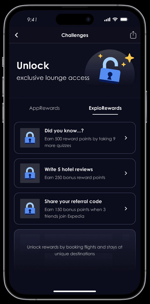
We designed a rewards feature within the app as a means of intrinsic gamification which will eliminate the issue of monotony and spark some sense of excitement in the user while using the app.
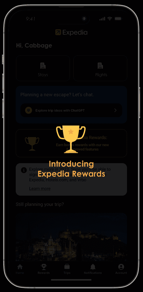
Introducing Expedia Rewards in the app


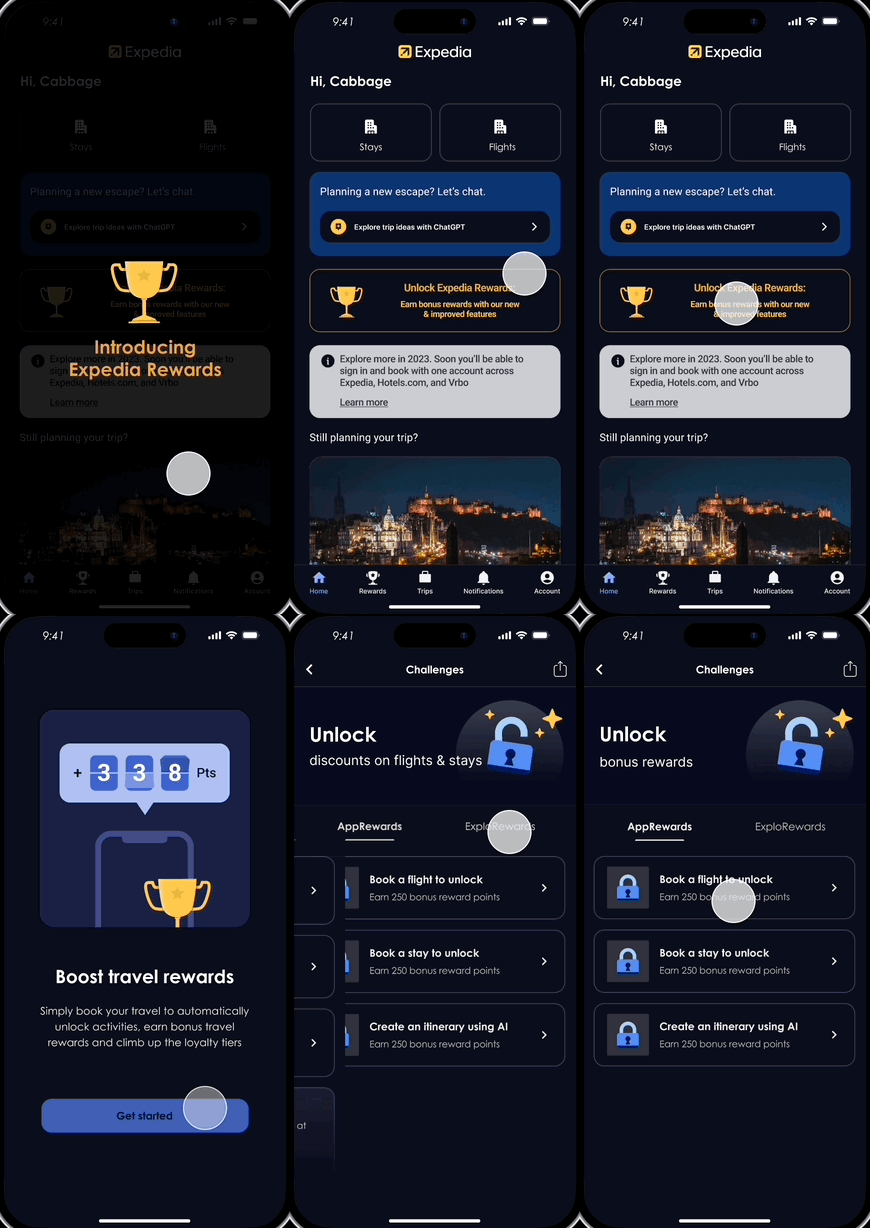
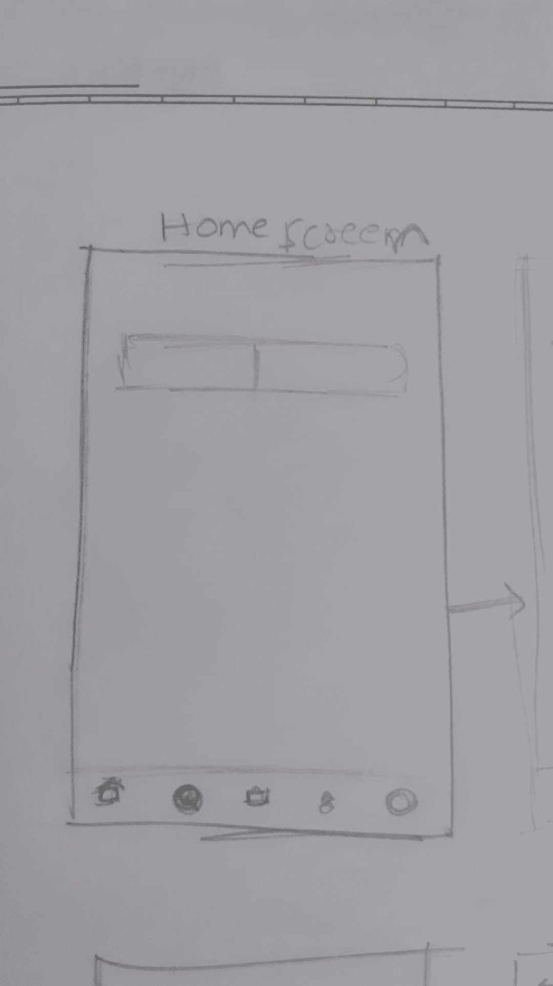
User can explore more about the Rewards feature from the introductory banner at the landing(home) page

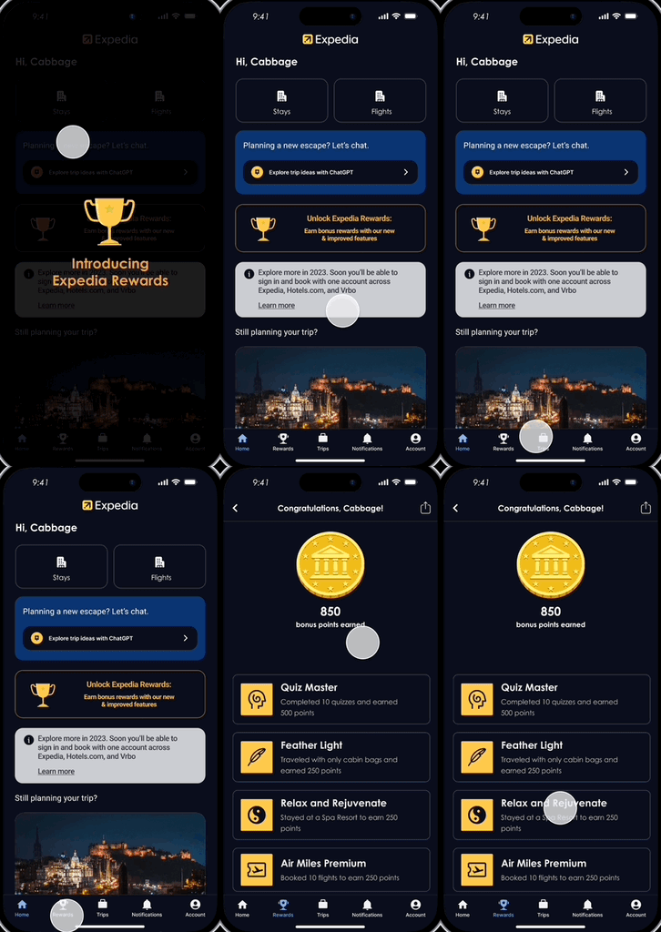
They can select the Rewards icon from the bottom navigation bar
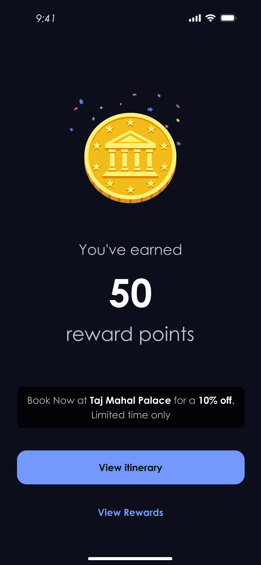
They can simply use Expedia normally, viz book tickets/hotels and find surprise introduction to Rewards placed at strategic steps during their flow.


OR
OR
Integration with the core app purpose
Seamless integration with the existing app to ensure that the user's primary goal of booking a flight and/or stay remains undisturbed.
Users with diverse travel styles and time constraints are considered and rewarded by both in-app actions and external engagement. Even day trippers can earn rewards.

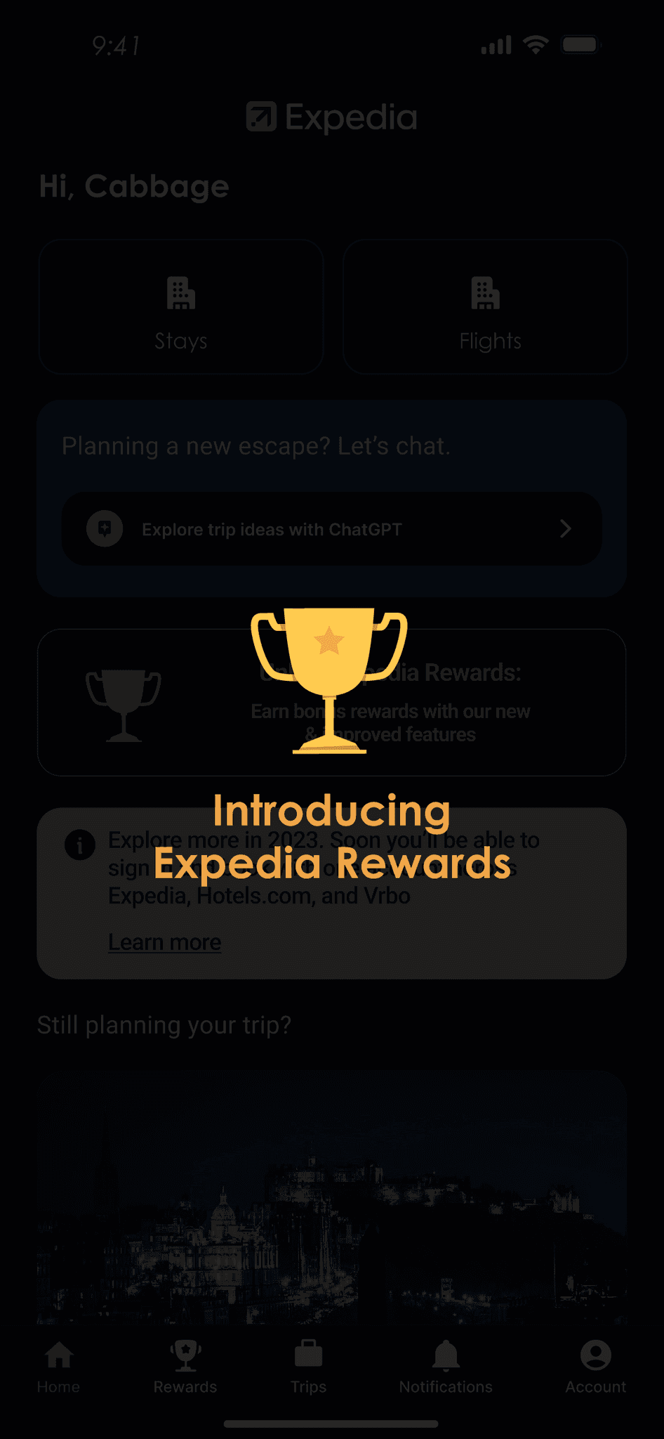

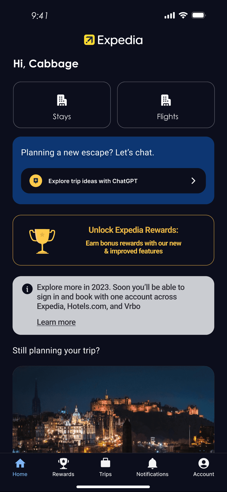
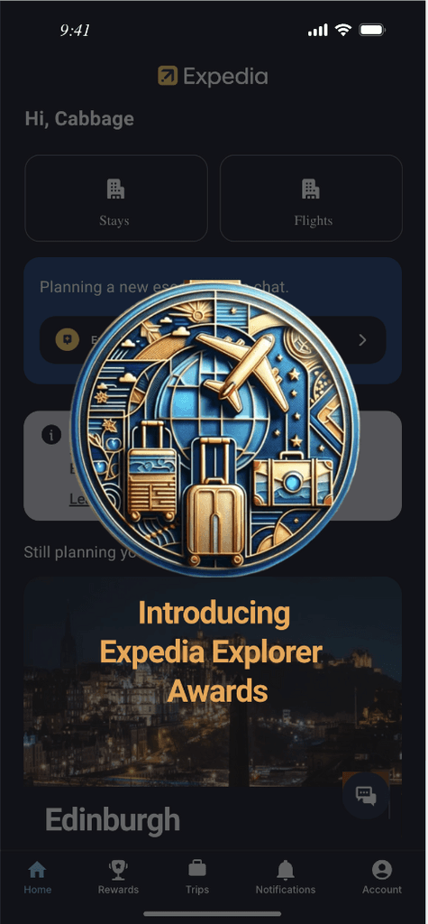
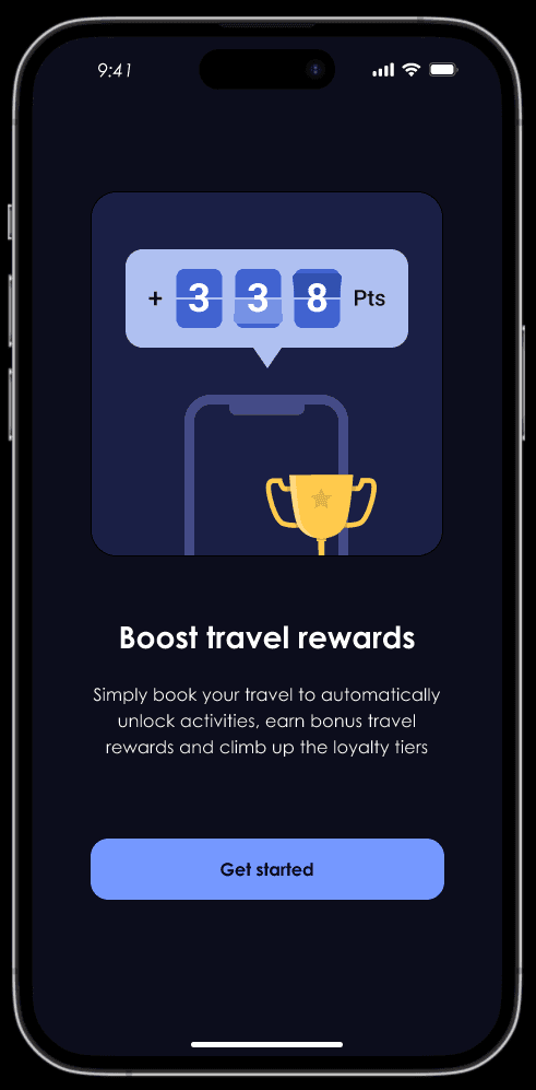
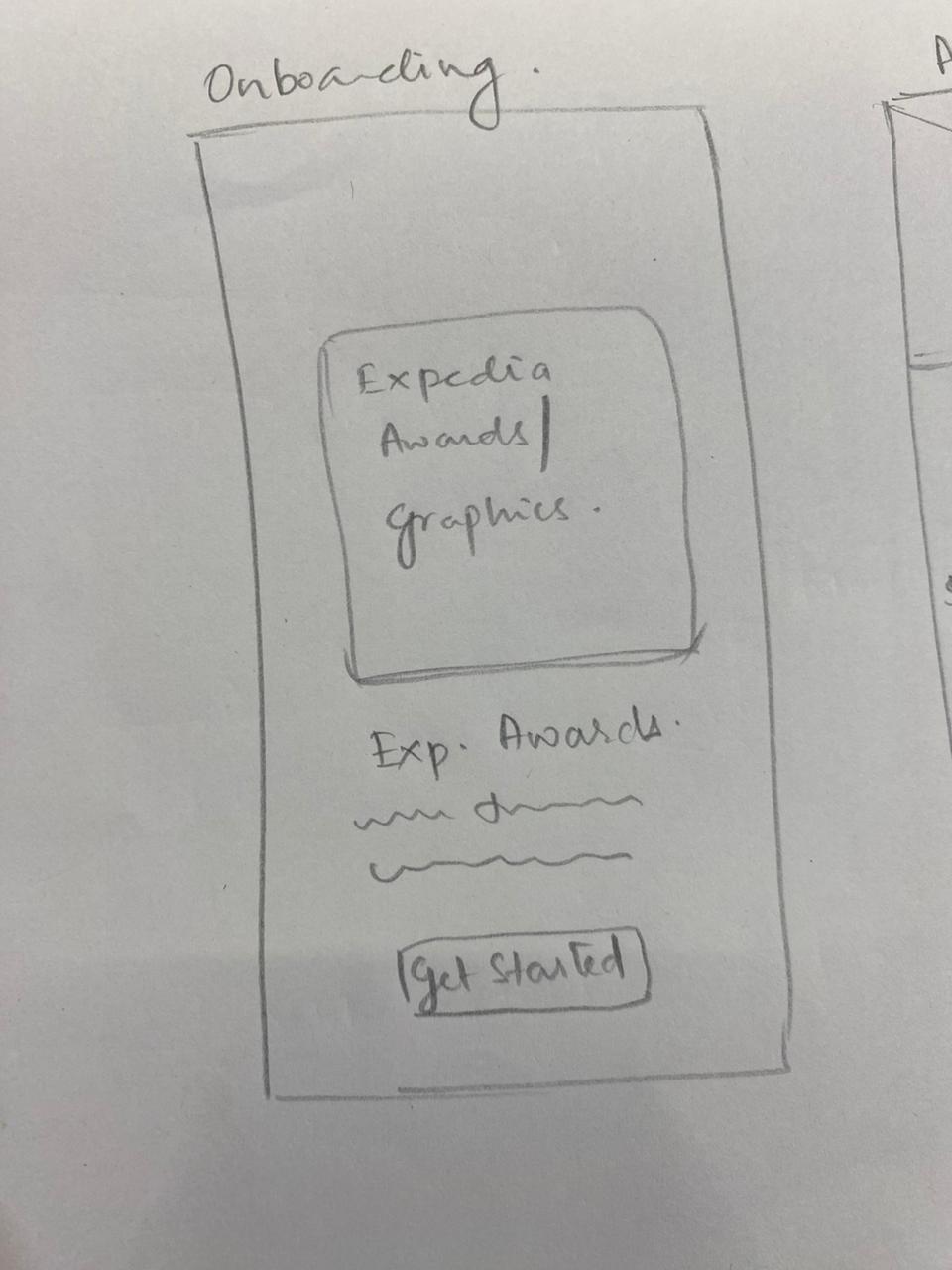
Introducing the new feature with an overlay. Tapping on the overlay takes the user to onboarding screens
Tapping outside the overlay takes the user to the app home. User can click on the banner if they have not started their rewards journey.
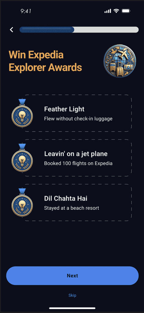
Easy transition from onboarding to core features
Smooth transition from onboarding to the core features to ensure that users can easily discover, navigate and utilise the app's full
functionality without overwhelm.
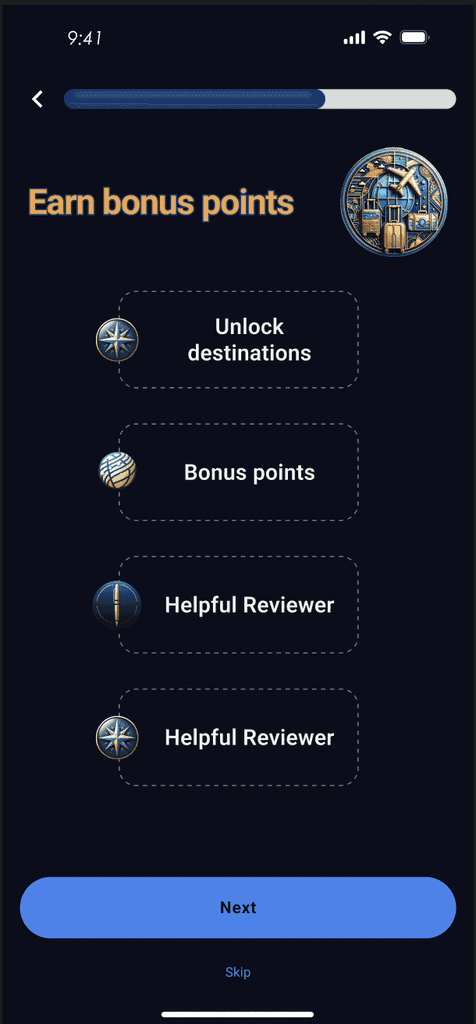
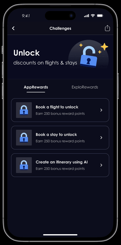
Text and icon signifiers guide the users through onboarding and integrate the challenge feature with the core features.

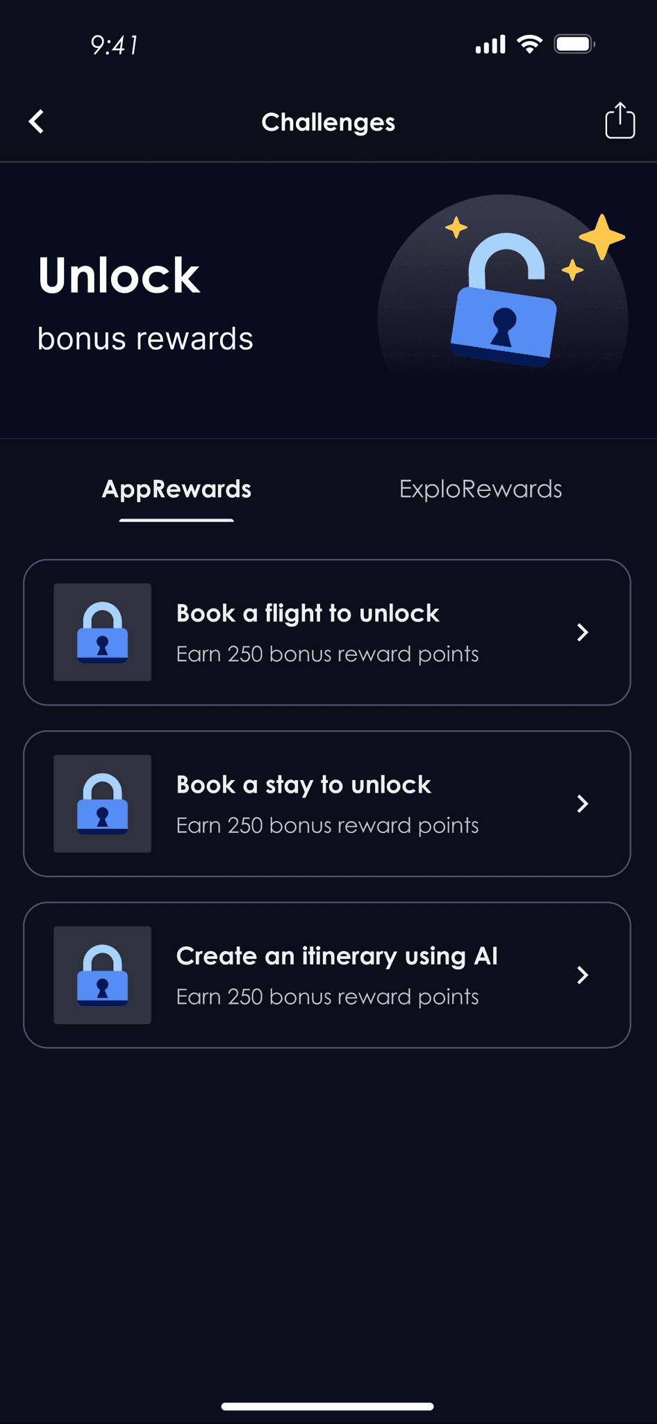

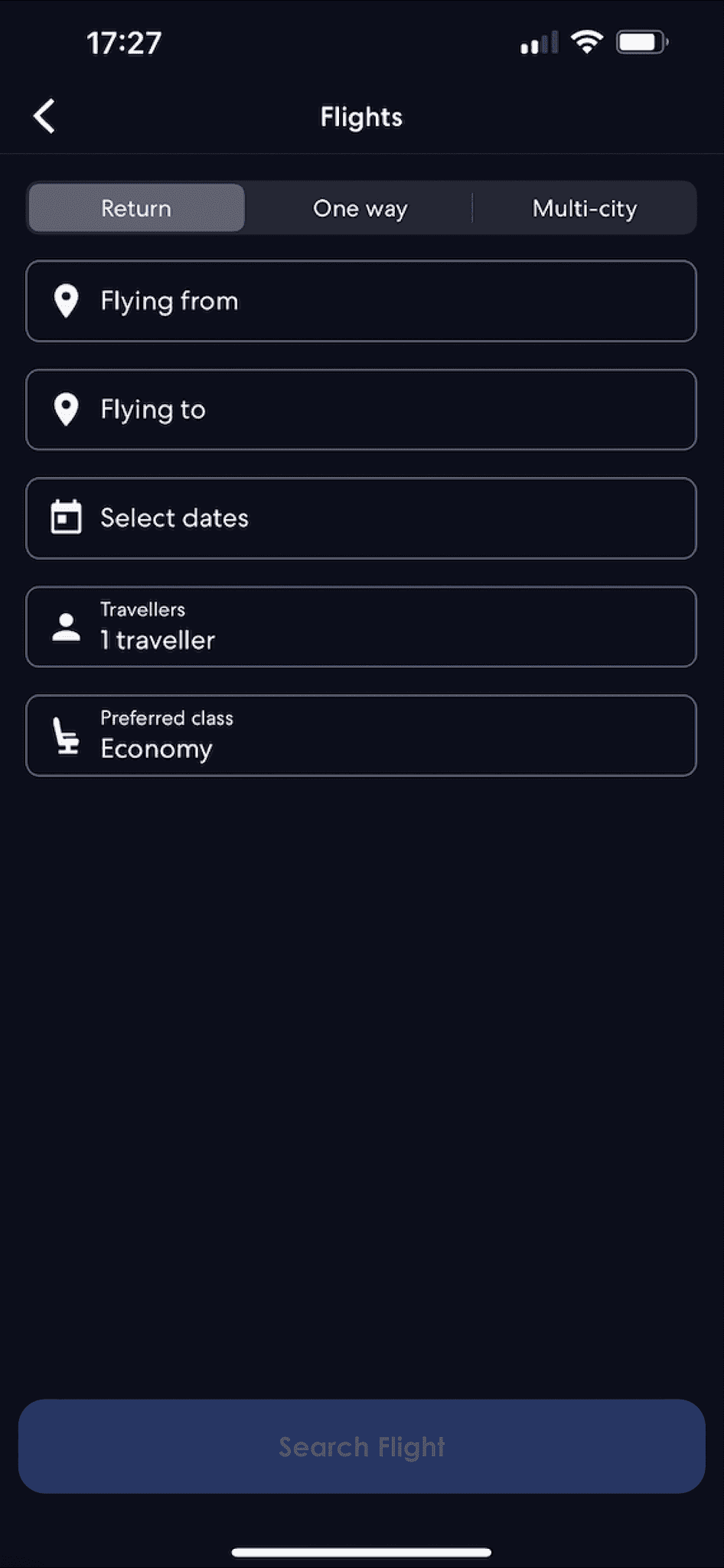
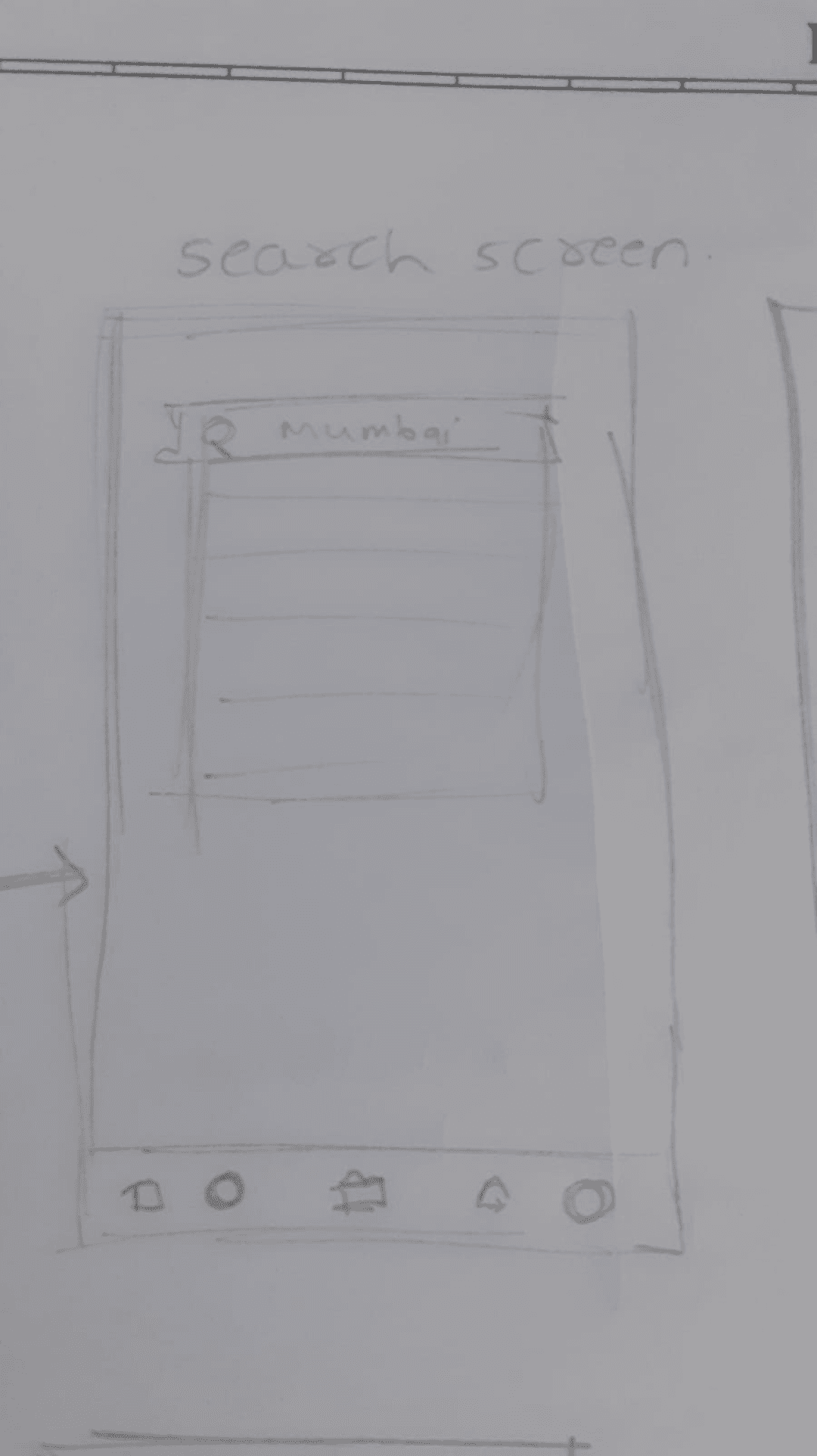
Clicking here takes the user directly to the Flights Search page. No need to go back to the Homepage
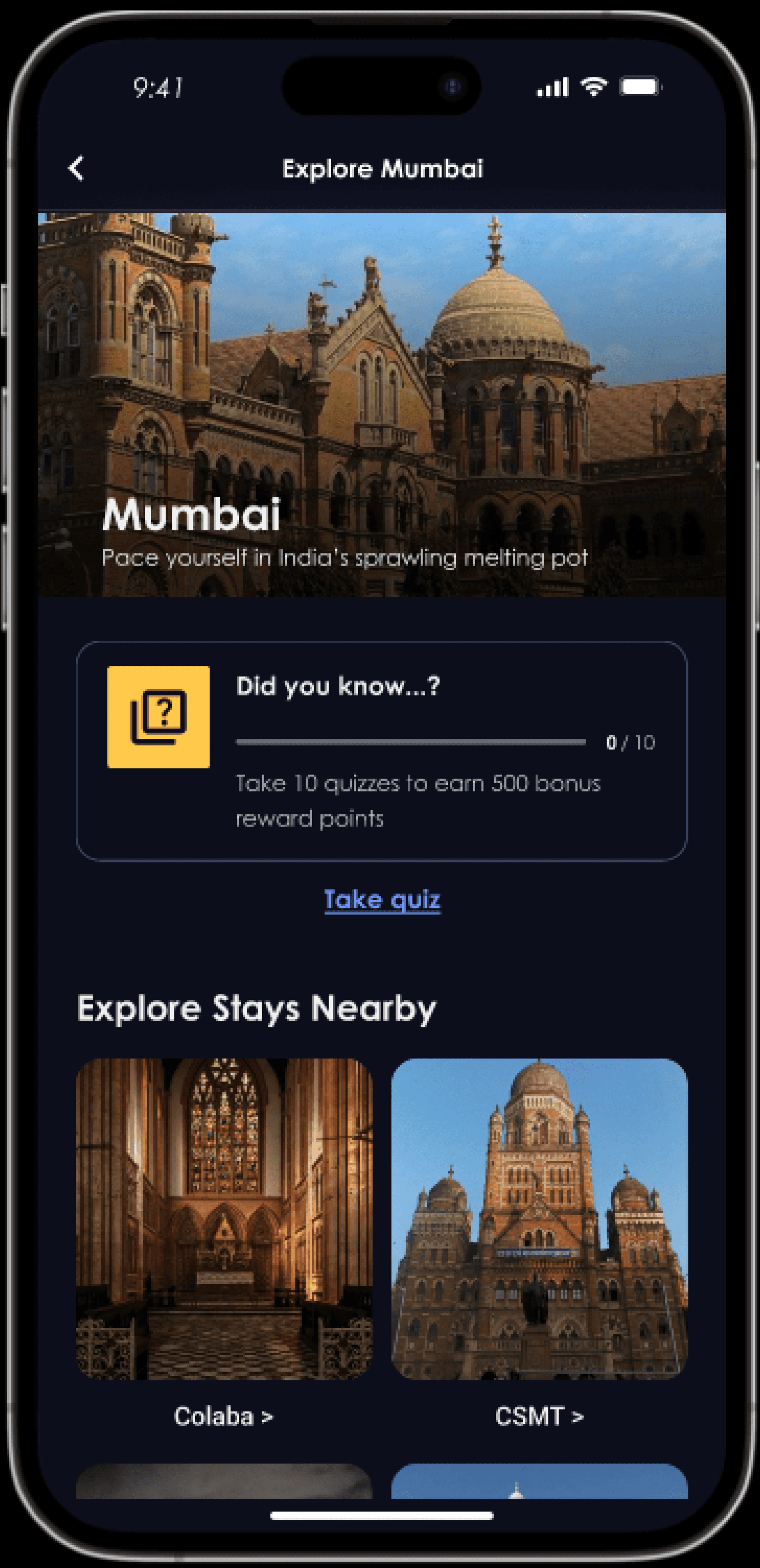
Unlocking new destinations and earning Rewards
Transformed travel planning into an rewarding endeavour by incentivising users to books flights or stays in new destinations.
Through personalised Gamification users loyalty is encouraged.

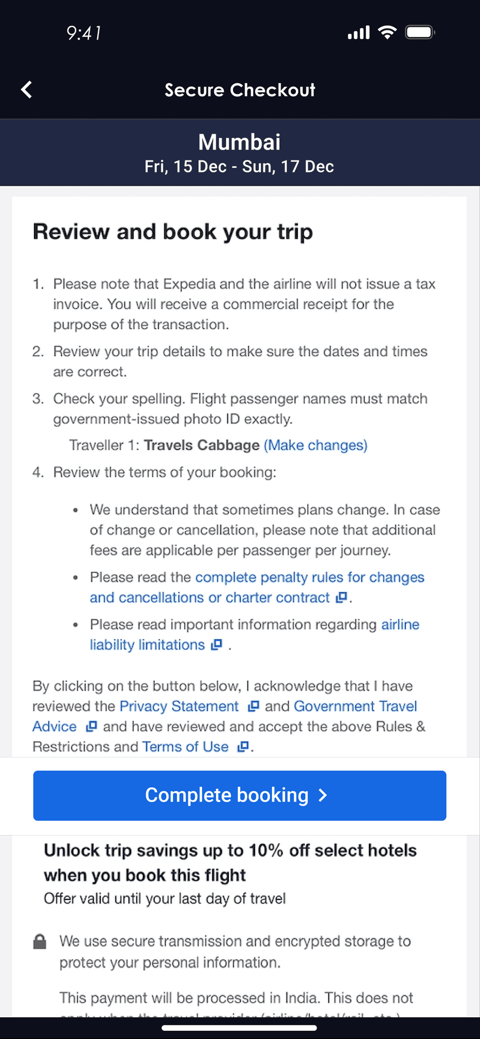

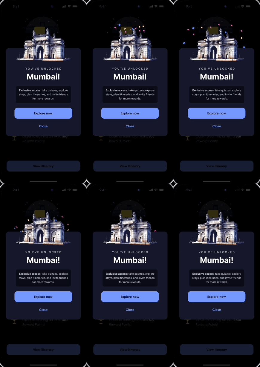
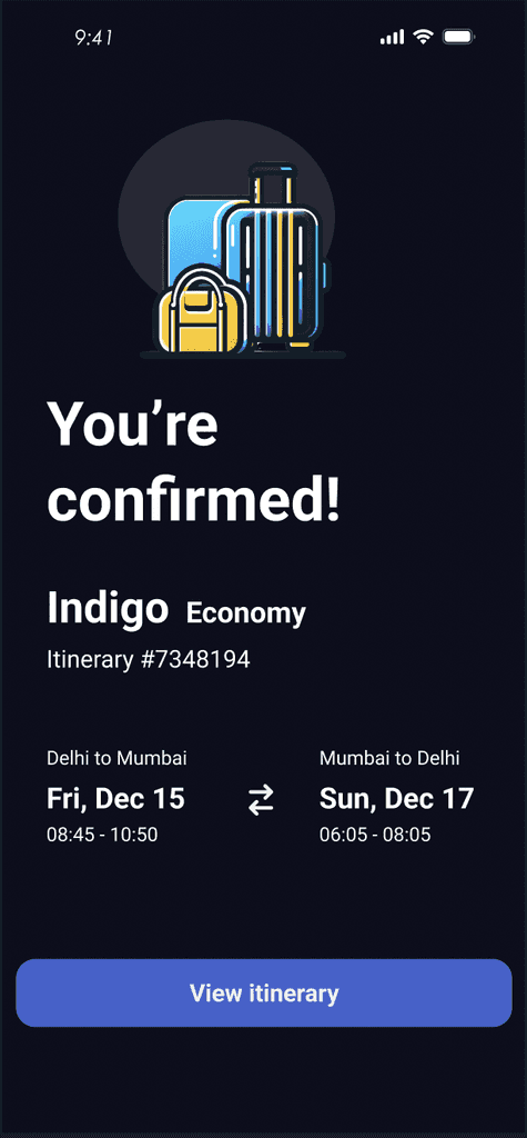
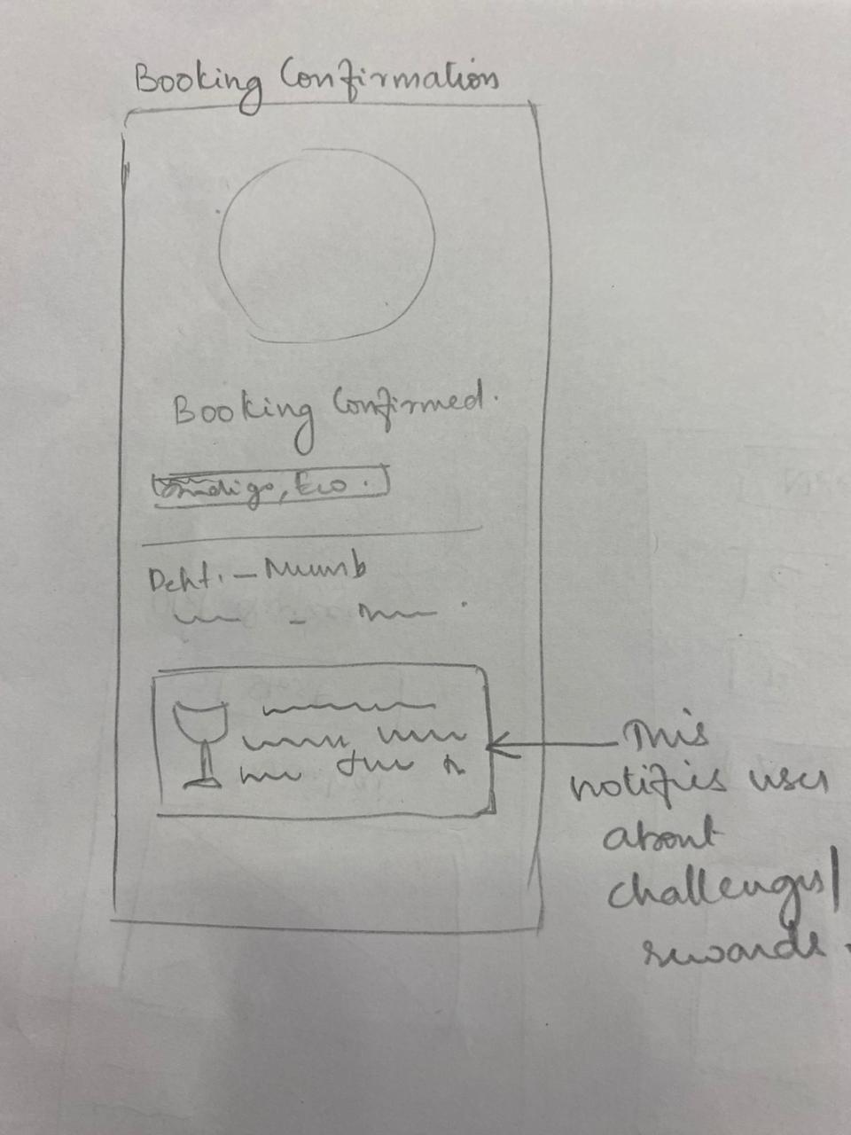
A flight booking to mumbai unlocks a gamified token of Mumbai in the app
Usability testing and iterations
First cut UI
Usability Testing
Usability testing was conducted remotely with three users representing different travel profiles:
international travellers,
business travellers, and
leisure travellers.
A combination of flow and
comprehension-based tests, followed by probing questions, was employed to evaluate the intuitiveness of the app and the user experience.
Flows were selected for tests based on critical user paths essential for user retention. Screens for comprehension based tests were selected based on textual information and complexity of the Ul elements.


Flow Test 1
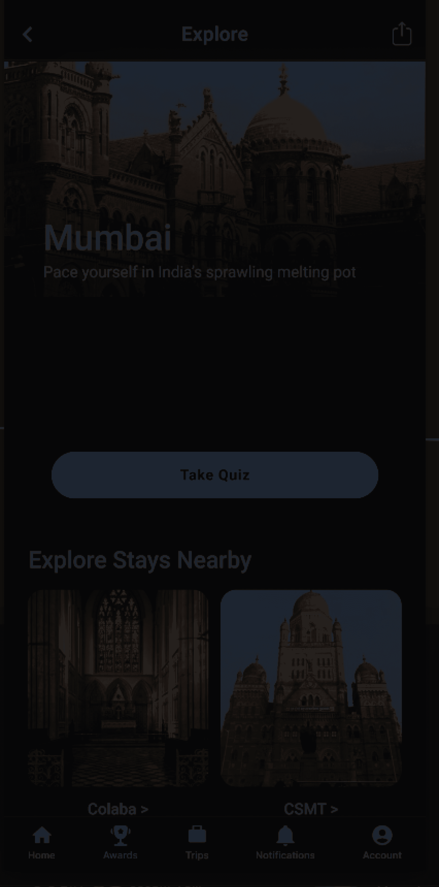
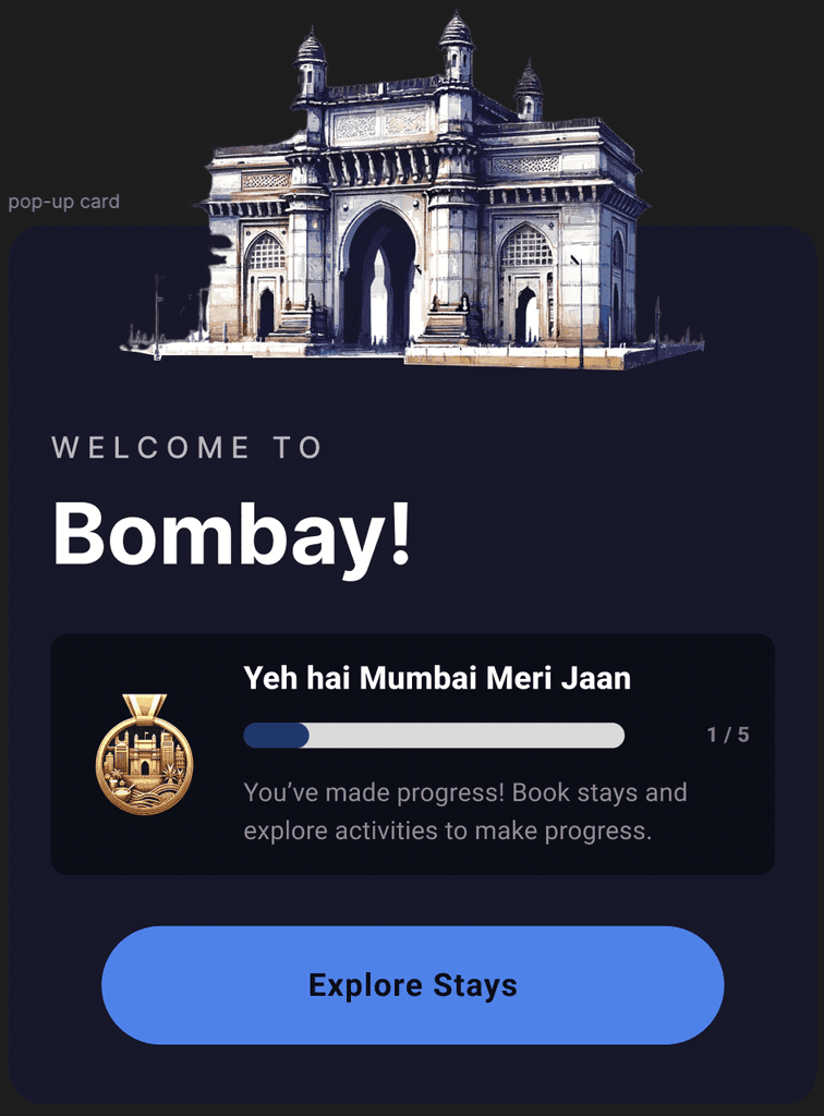
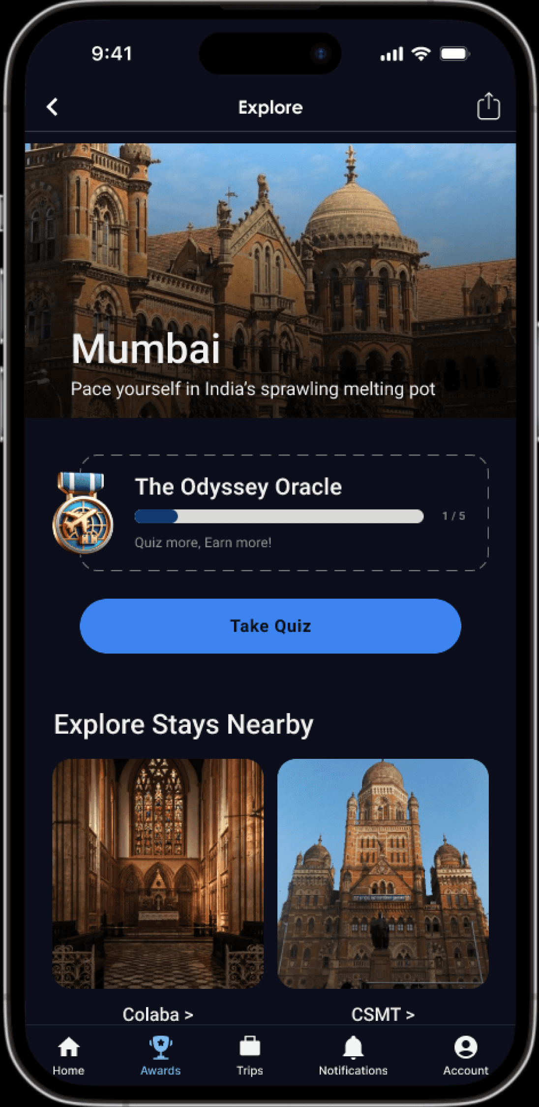
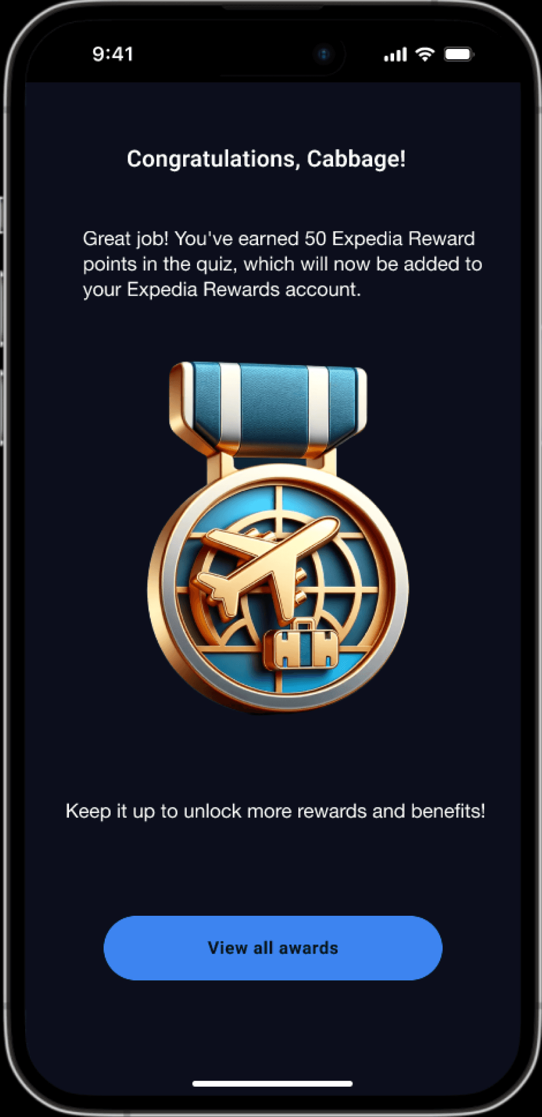
Navigate to and demonstrate how to earn reward points through various activities on the platform
Flow Test 2

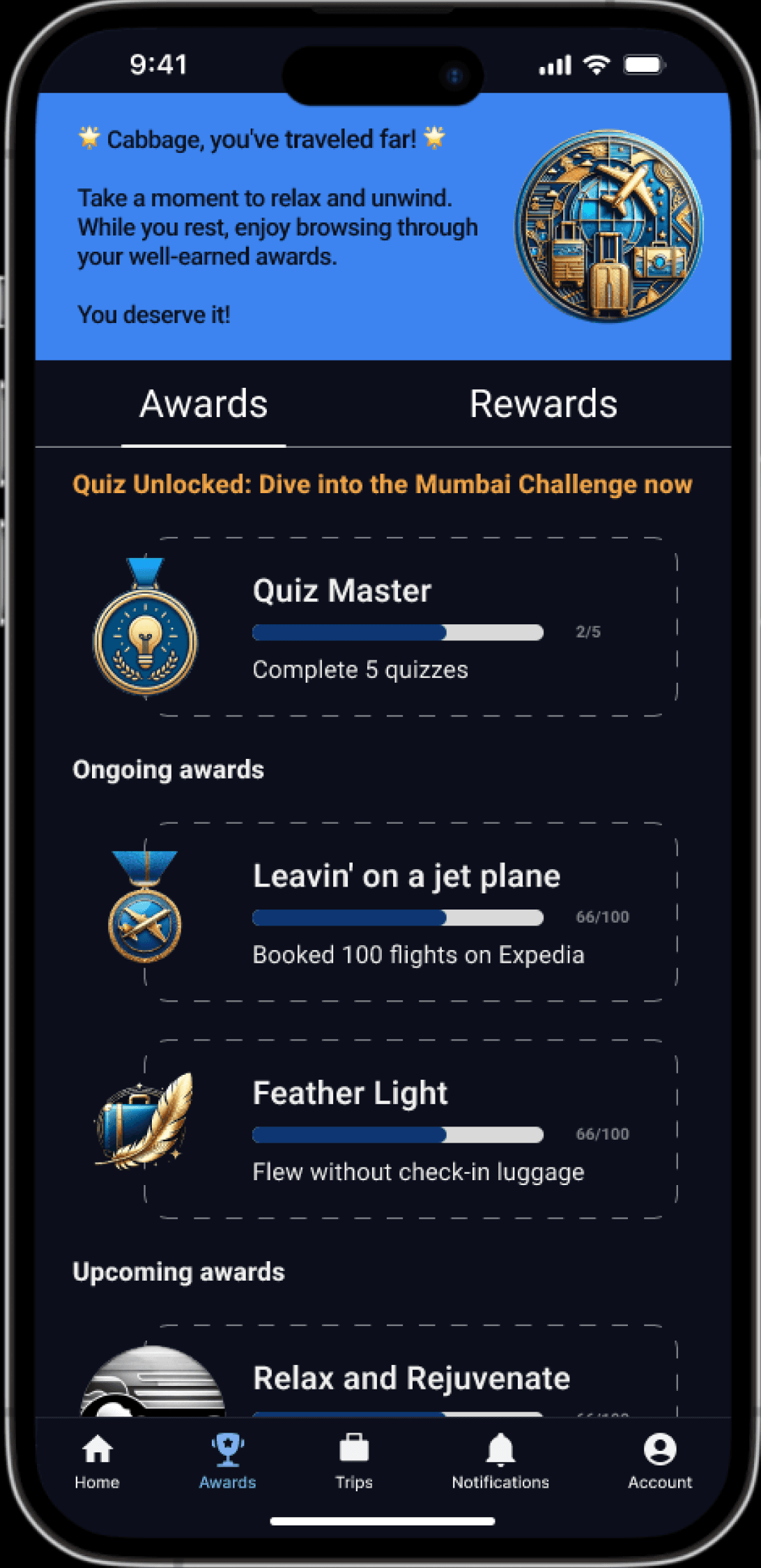

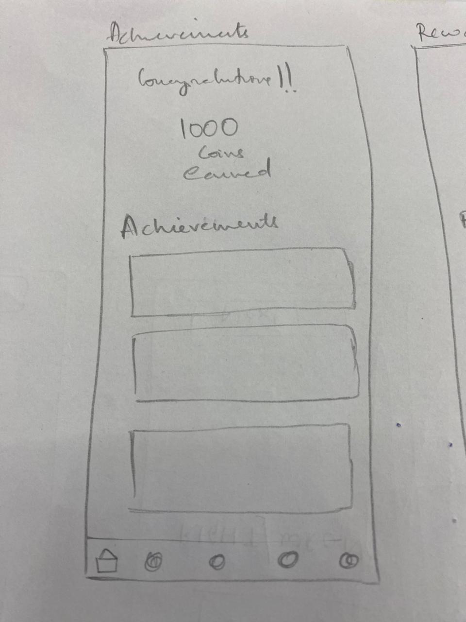
Locate the sections where you can check your Rewards point balance
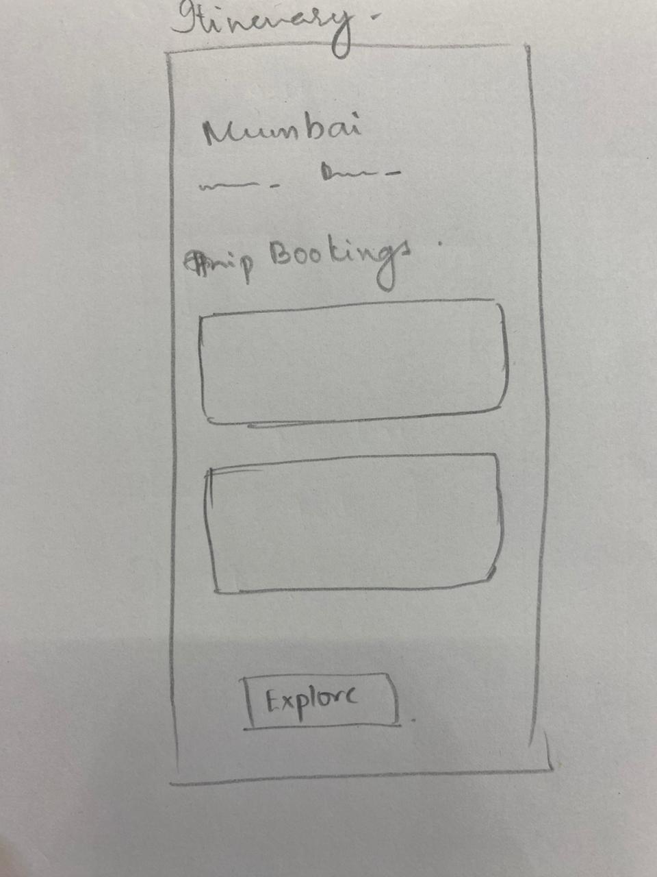
Navigate to the section where you can view your itenary
Comprehension based tests

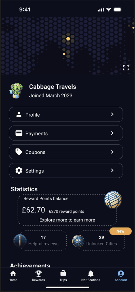
Users were asked to explain what they believe "Quiz Unlocked: Dive into..." text means to assess whether it clearly communicates that it is an actionable item
Users were asked to explain what they understand from "ongoing awards" and to explain an award they see on the screen to assess whether the progress bars and names of the awards are self-explanatory.
Users were asked to explain their understanding of the
"Statistics" section to assess whether it is clear that how much bonus rewards they have earned.
Users were asked to explain what
"unlocked cities"
might mean to test if users can intuit the meaning behind their achievements and whether earning the reward is motivating
Insights from Usability Testing


Although not part of the test, all users informed that they ignored this as the text was difficult to read. One user believed this was an ad banner.
It was not clear to the users that this text is an actionable item but the "Quiz Master"
below that is actionable.
Users familiar with western pop-culture enjoyed and appreciated this word play.
However, as the features are being tested for the Indian market, we decided to make the names easier to understand
Users understood how many points they earned but did not
understand how to redeem them.
Users understood that a new city was unlocked following their successful flight booking. All users informed this was because of the overlay at confirmation and the
"new" notification chip.
Iteration after Usability Test
Revised texts and icons for clarity and brevity

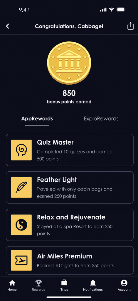
WHAT CHANGED?
Description of challenges and rewards was revised to be clear, simple and straightforward.
Icons were changed to be relevant to the description and maintain consistency with the rest of the Expedia app
WHY?
During testing, it was clear that users did not easily understand what needed to be done to progress in the challenge as the language was too prosaic.
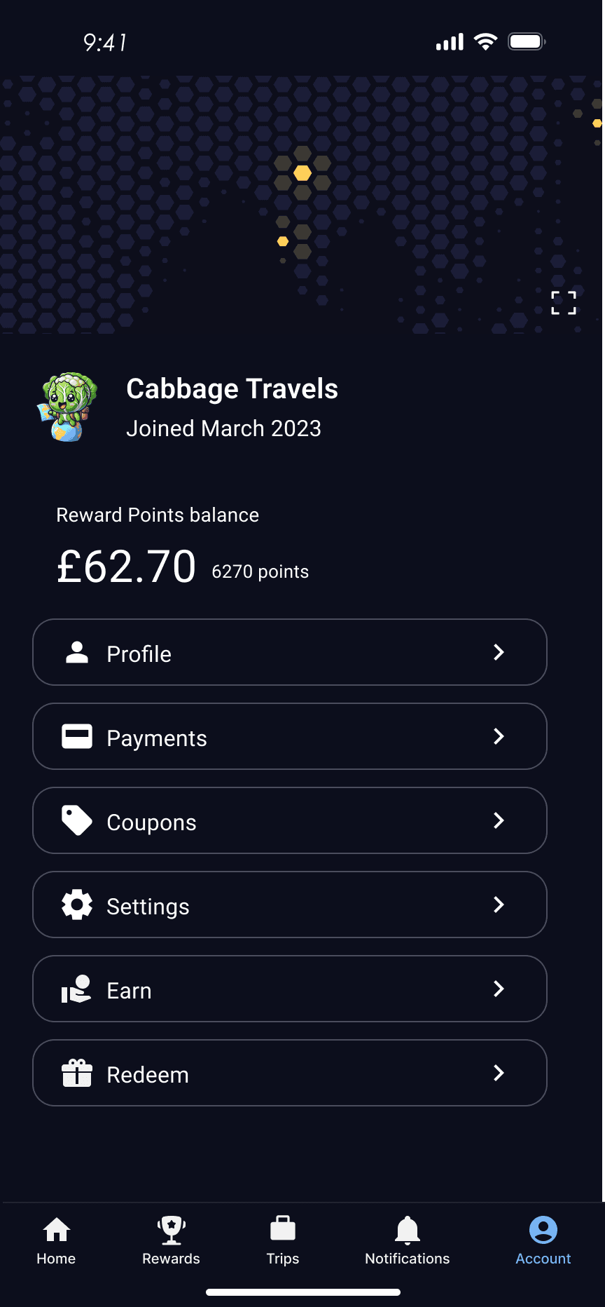
Visually balanced UI elements
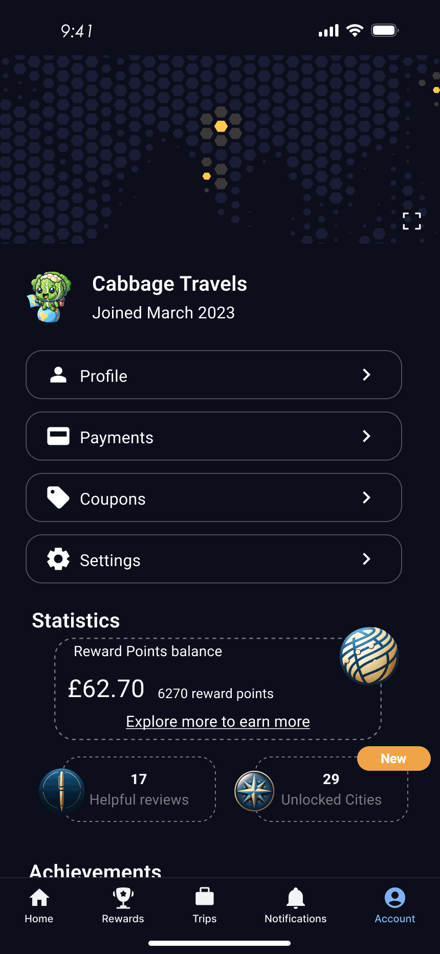
WHAT CHANGED?
Ul Elements were changed for visual balance. "Statistics" was replaced with "Reward Points Balance" for clarity
WHY?
The design and text were not easily understood by all users and was inconsistent with Expedia's design language.
Clear Feedback and increased convenience
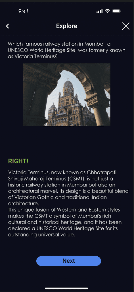
WHAT CHANGED?
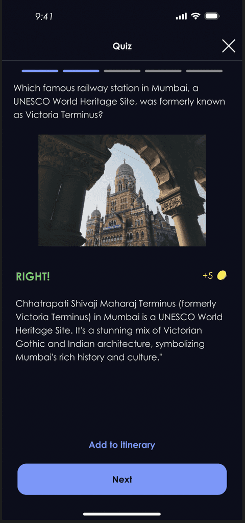
Added a progress indicator to show how many questions remaining, added a points indicator to show how many points earned, reduced text to reduce cognitive load and added the option to add the sight to the user's itinerary
WHY?
Adding progress indicators provides immediate, clear feedback to the user which can be motivating and gives a sense of achievement. Adding a CTA to add to itinerary encourages user to engage further with the app once at their destination
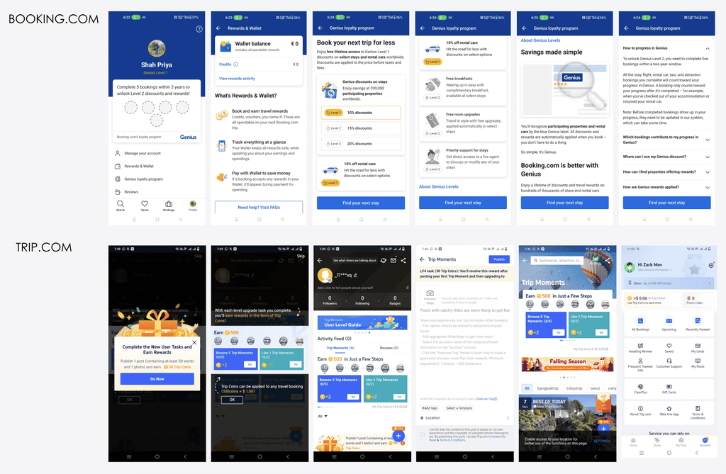
Design Process Journey
Competitor Research
Gained inspiration for new ideas by analysing the approaches employed by apps known for their gamification such as Booking.com and TripAdvisor
Identified common design elements, features and user experiences which resonate with users.
Observed shortcomings and pitfalls of other apps to avoid making the same mistake (example: Security concerns with geo-tagging)
Insights from usability tests were users to oresent the challenges in a manner that is easy to user and understand.
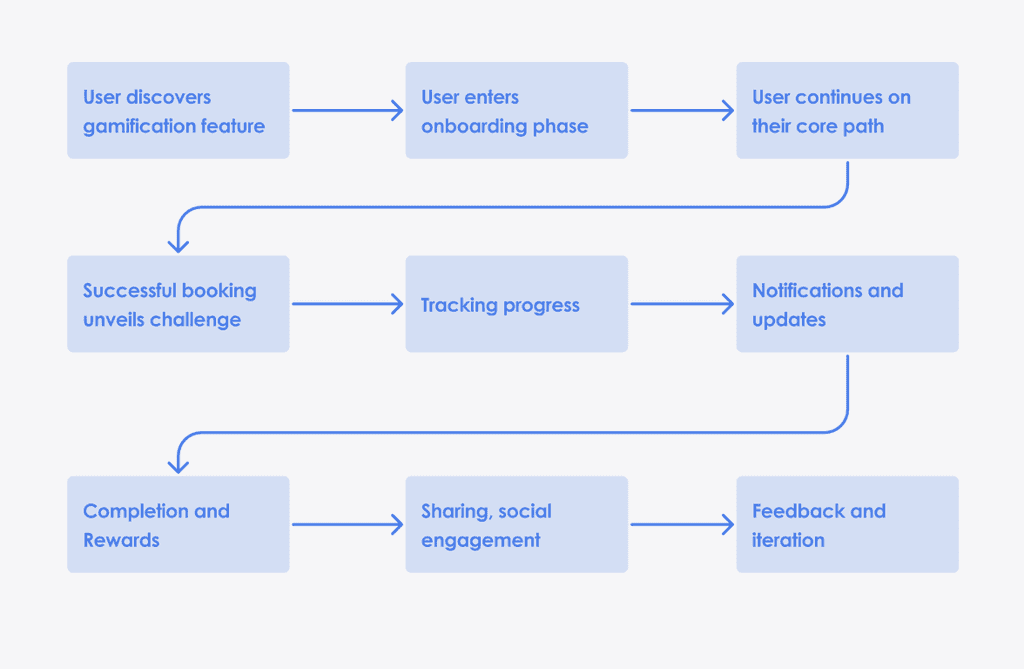
Macro Flow
Considering the overall sequence of steps a user takes to achieve their goals within the app is crucial for designing a seamless, intuitive and enjoyable user experience.
By considering the user's macro-flow from discovery and onboarding to reward redemption helped:
identify pain points and potential areas of friction that will hinder the users from completing their tasks,
ensure that the design and functionality of the new features are consistent throughout the user's journey,
align the user's primary goals and objectives with the new features,
prioritise the features and interactions that directly contribute to achieving these goals
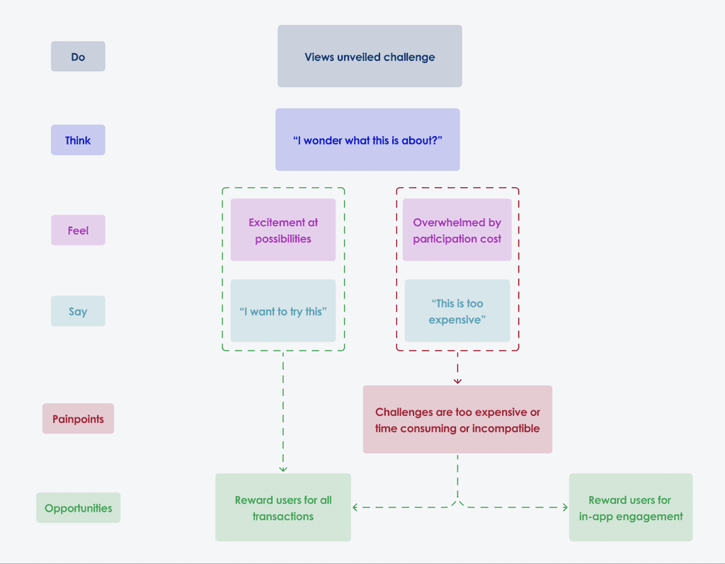
Unveiling opportunities and pain points
Understanding what users do, think, feel, and say when interacting with the app was crucial to optimise the users journey and enhance app effectiveness.
This in-depth analysis revealed areas where the user encountered friction or frustration and uncovered opportunities to refine the process and foster a more engaging user journey.
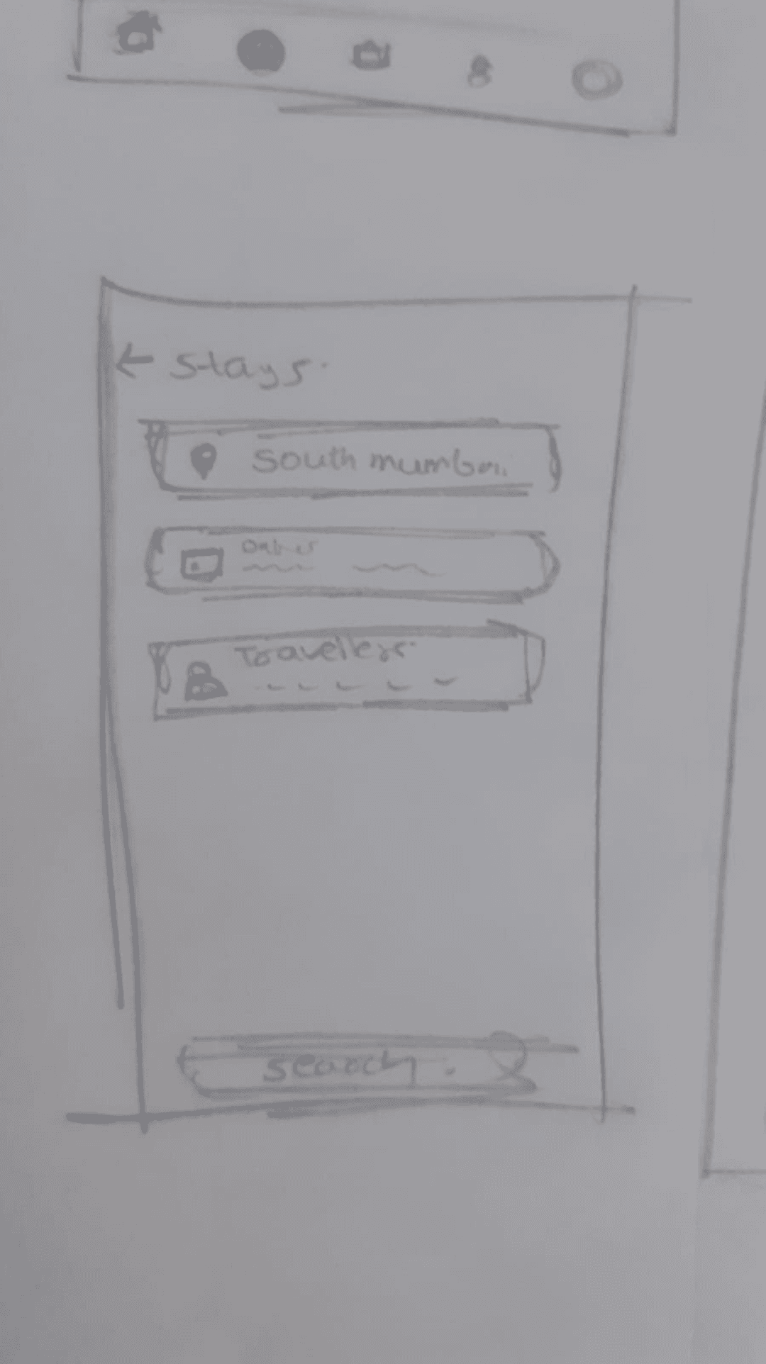
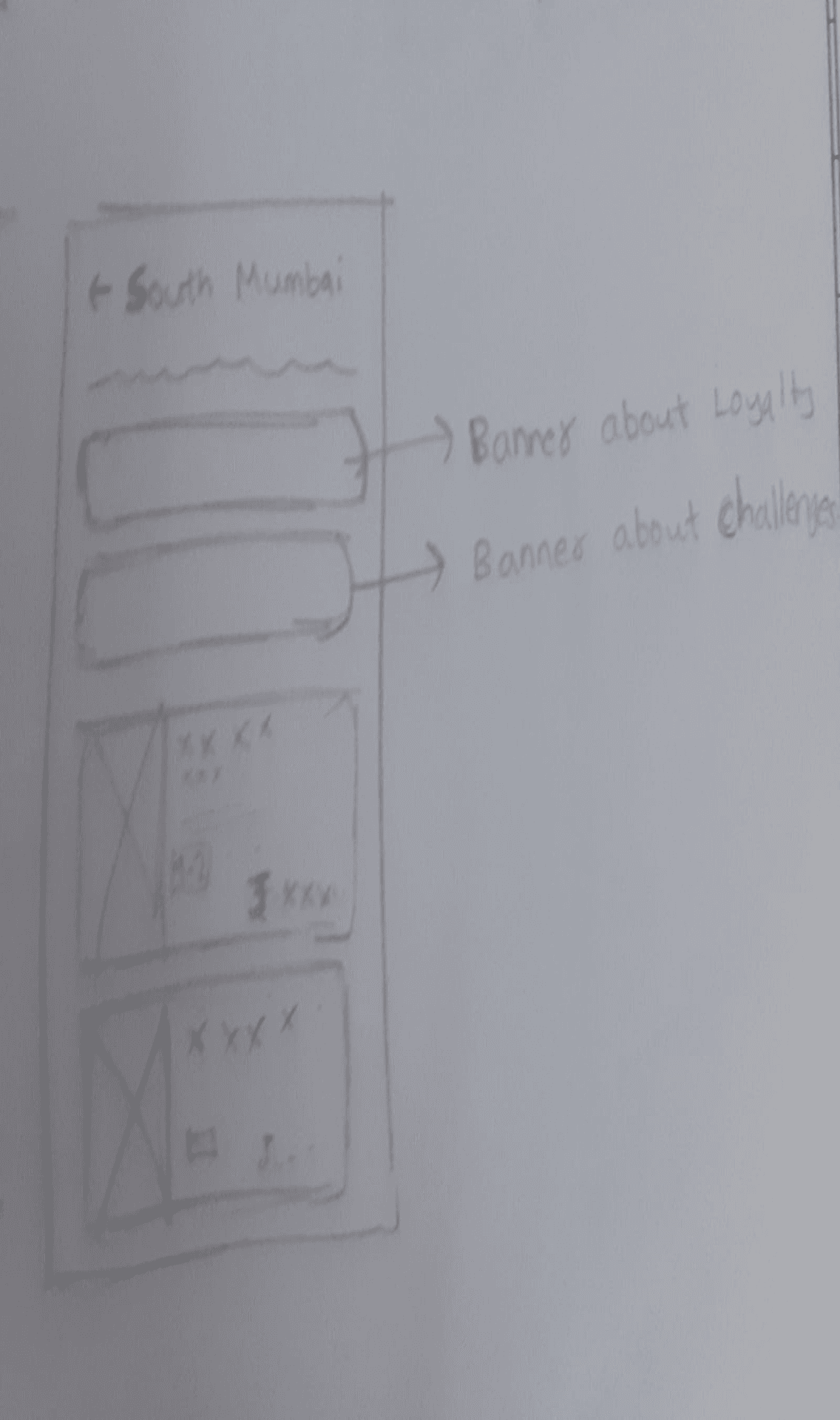
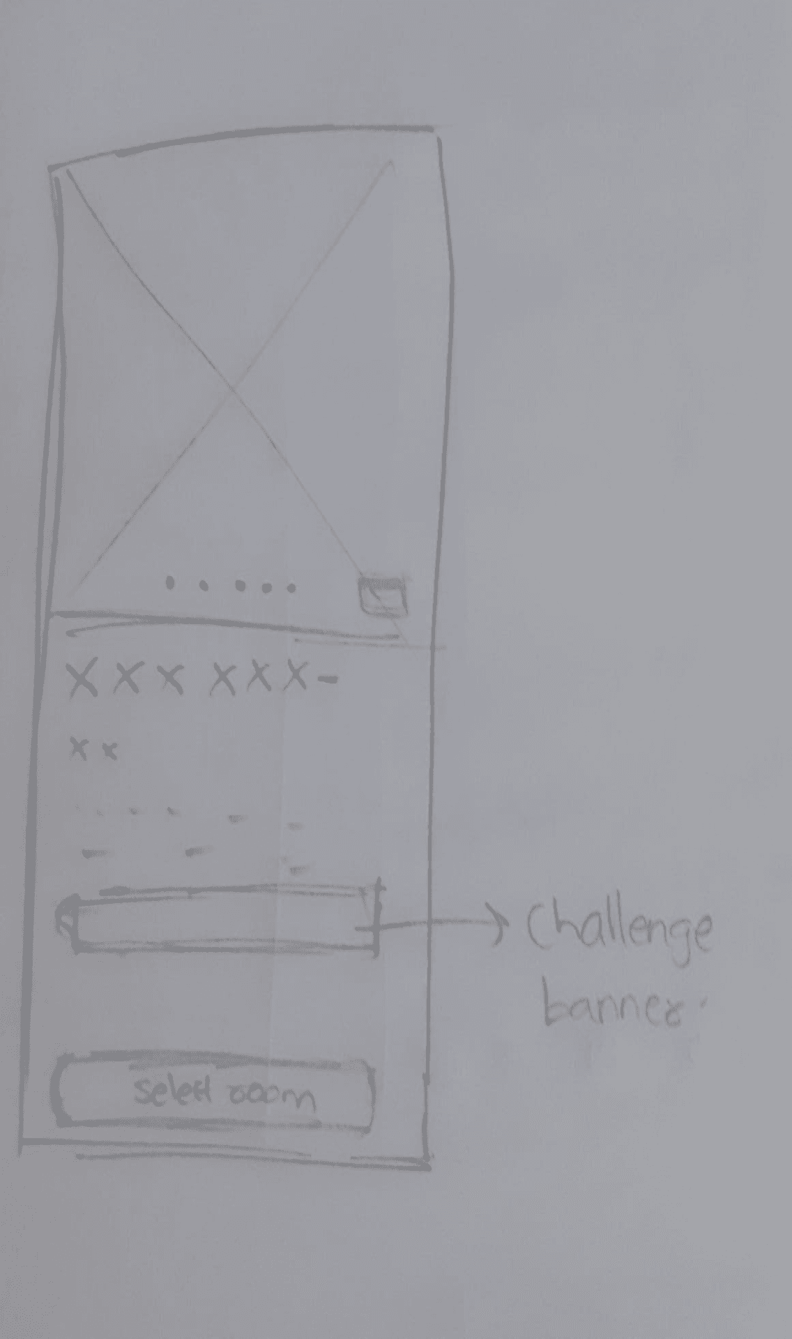
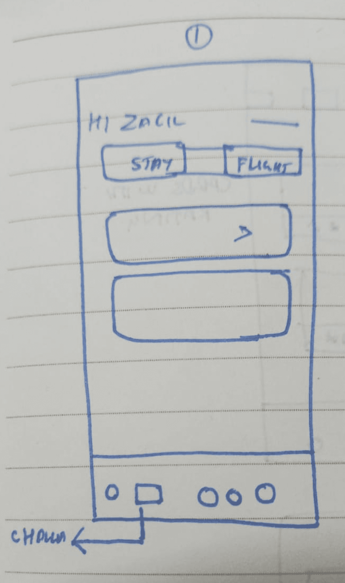
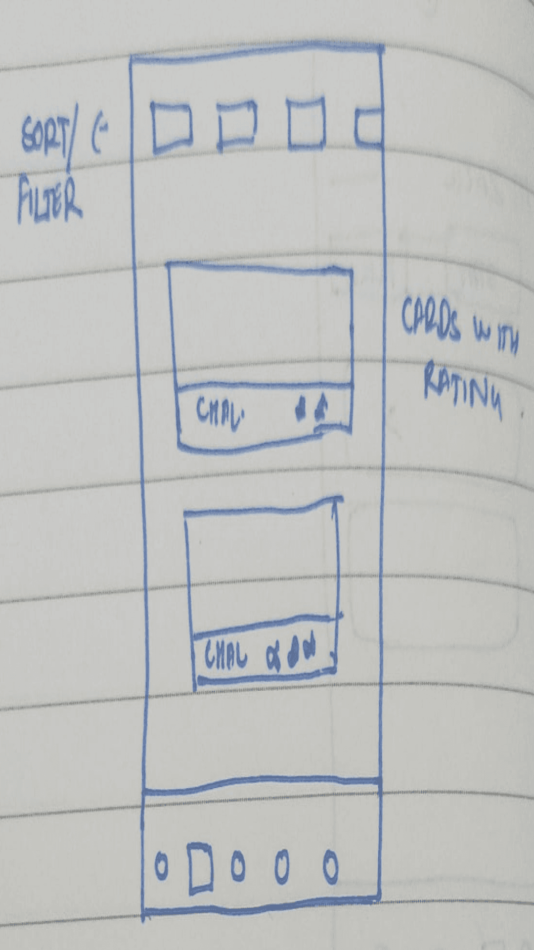
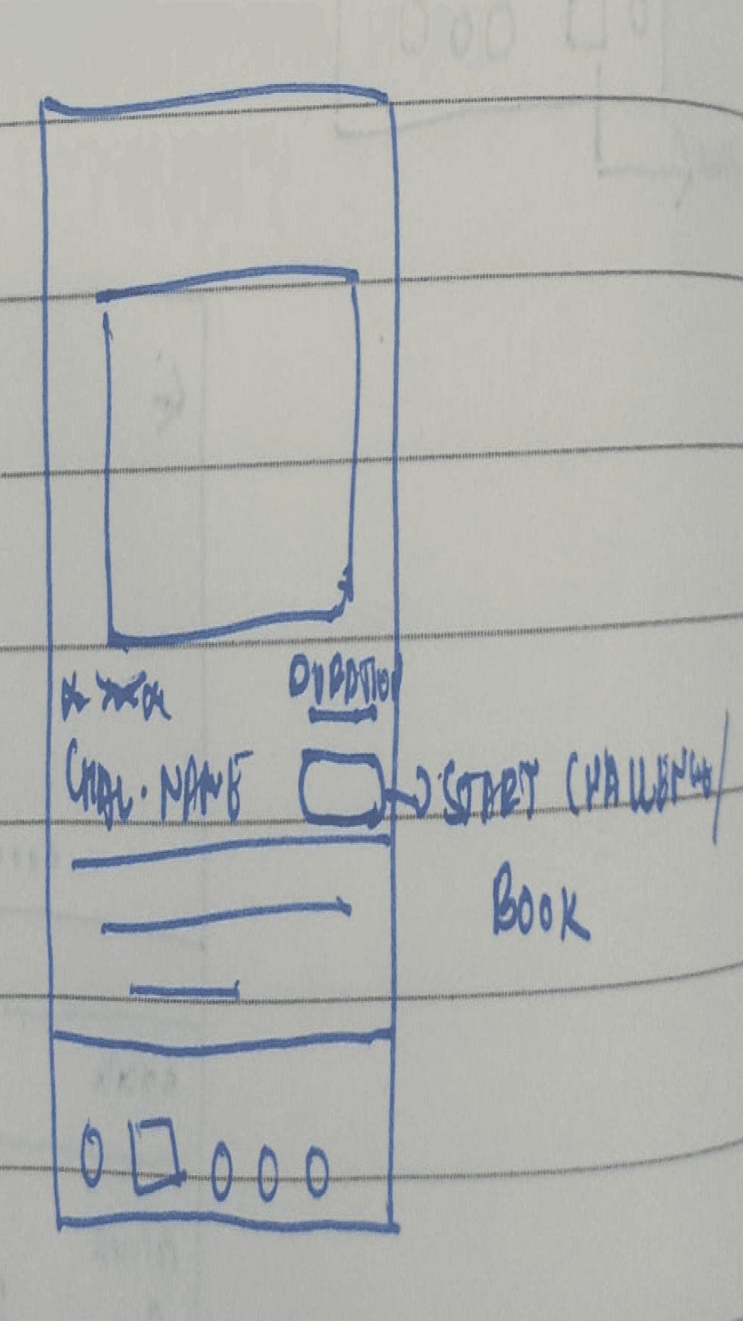
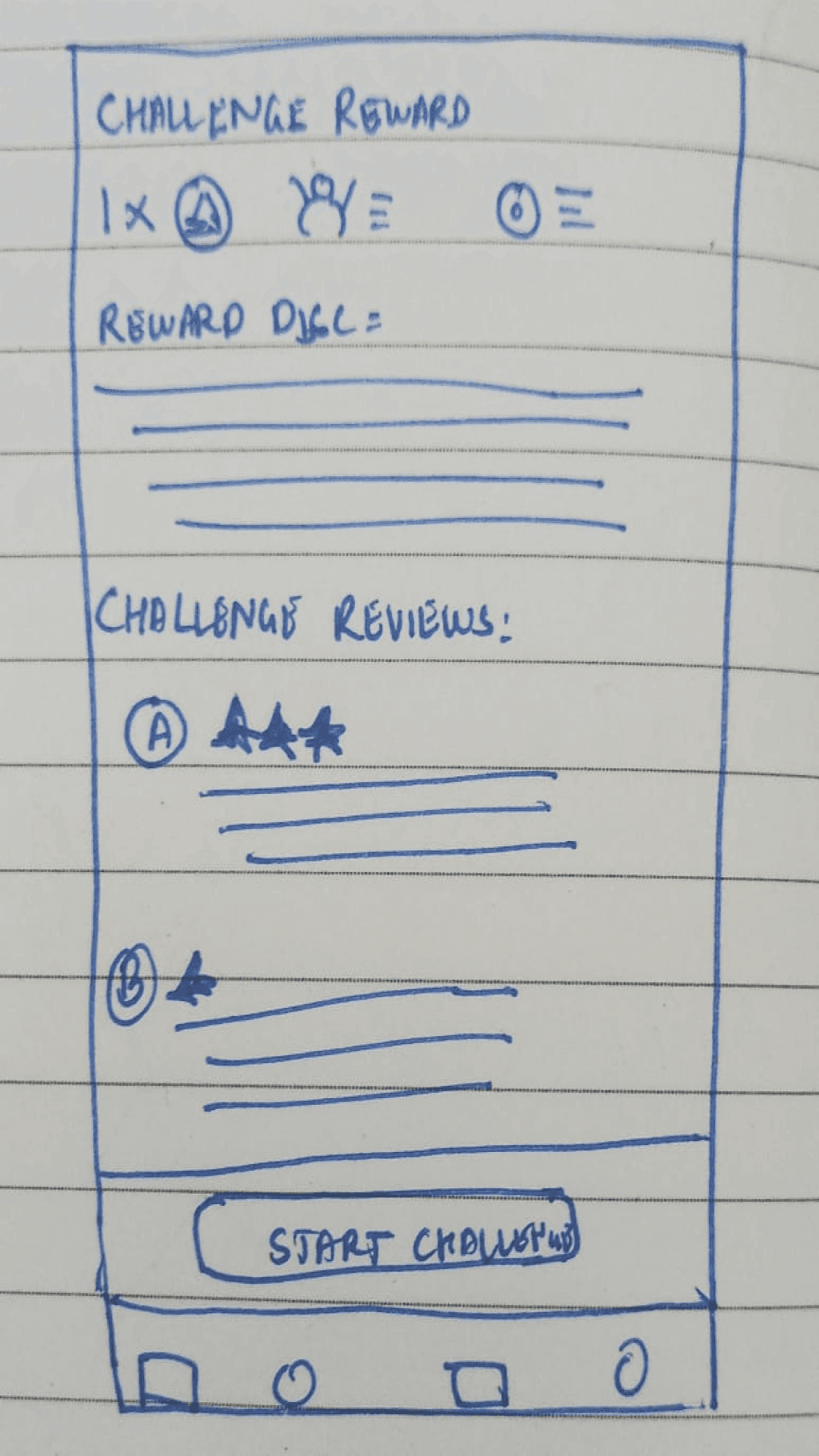
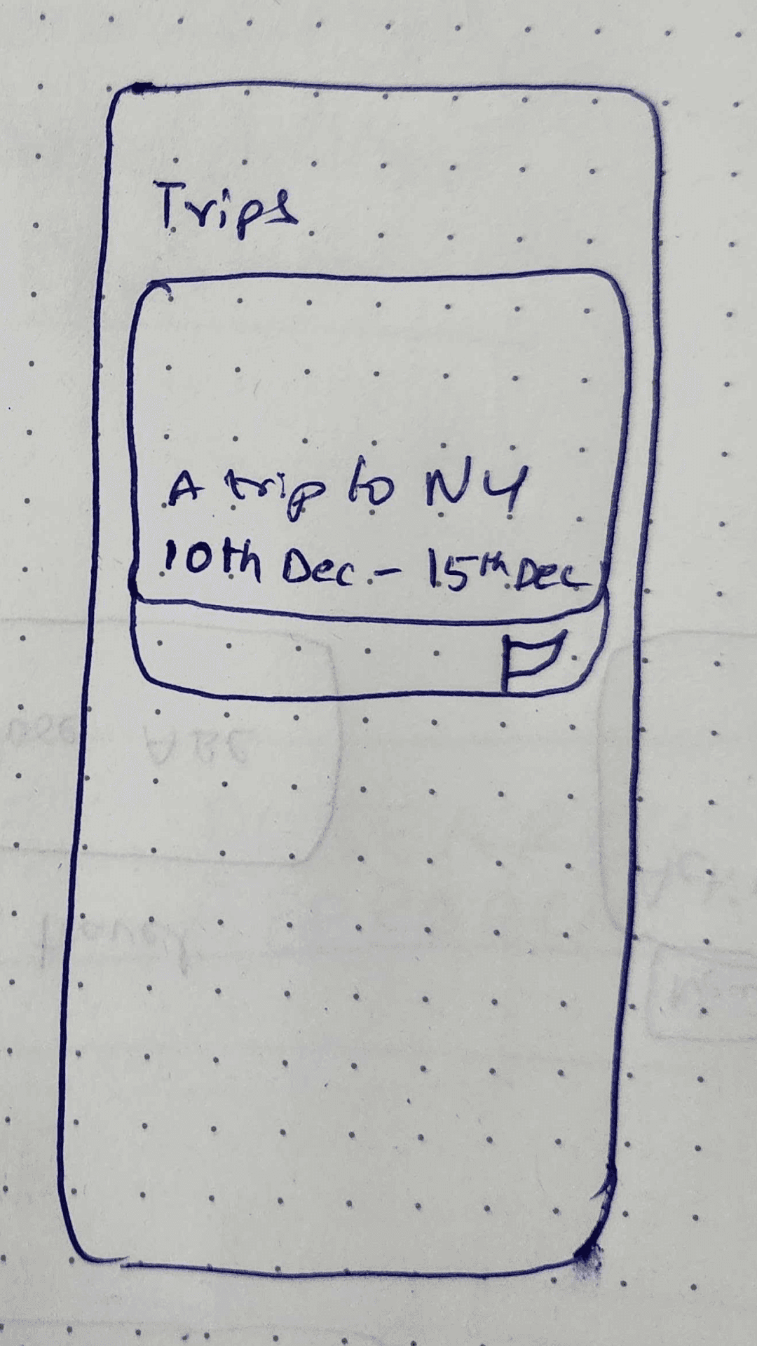
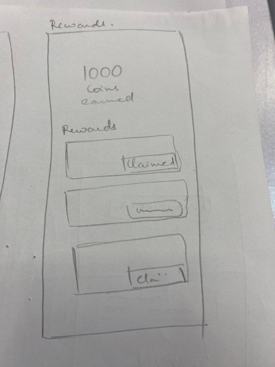
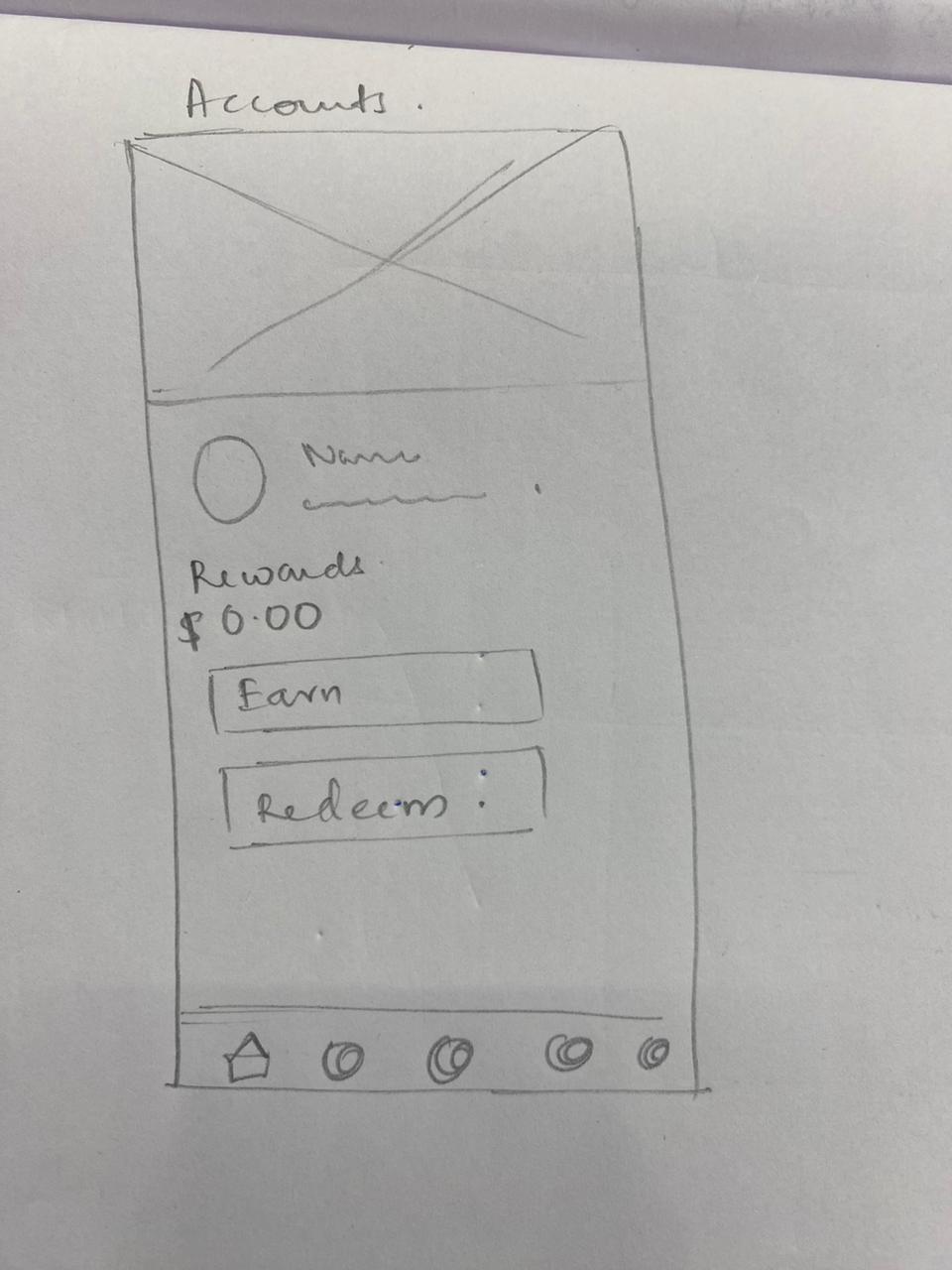
Wireframing
Gained inspiration for new ideas by analysing the approaches employed by apps known for their gamification such as Booking.com and TripAdvisor
Identified common design elements, features and user experiences which resonate with users.
Observed shortcomings and pitfalls of other apps to avoid making the same mistake (example: Security concerns with geo-tagging)
Insights from usability tests were users to present the challenges in a manner that is easy to user and understand.
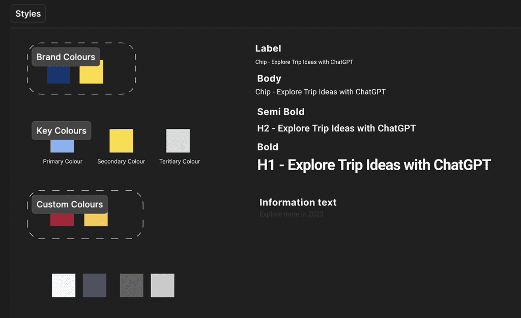
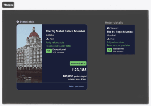
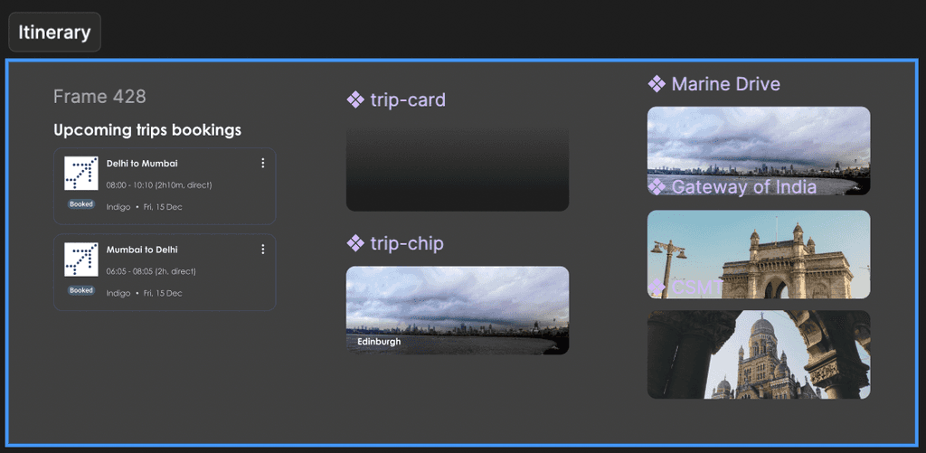
Assets, Styles and Components
Cohesive and Scalable design
Created assets, components and defined text and colour styles to ensure a consistent design system where the Ul elements are visually unified.
The reusability and modularity of these components sped up the design and development process reducing duplicative effort.

Learnings
UX and Project skills
Deeply understood the importance of considering user behaviours and perceptions in design decisions and how to conduct a usability test to understand the user needs and expectations.
Learnt to create a cohesive design system with consistent colours, typography and Ul elements.
Learnt the distinct value of low-fidelity and high-fidelity prototyping and how to use them effectively at different stages of the design process.
Learnt prototyping techniques and how to visualise and test design before implementation
Transferrable skills`
Experienced the power of teamwork, collaboration and contribution of peer-reviews to create high-quality designs and enhance the final product.
Understood deeply the iterative nature of Ul design and embraced continuous improvement and refinement.
Learnt the value of being adaptable, flexible and patient while gradually improve the product with each iteration.
Understood the importance of a clear user flow for an intuitive and user-friendly design. Understood the deep connection between design and usability.
Gained effective prioritisation skills for efficient decision making within time constraints and the importance of balancing discussions with decision-making with project deadlines.
